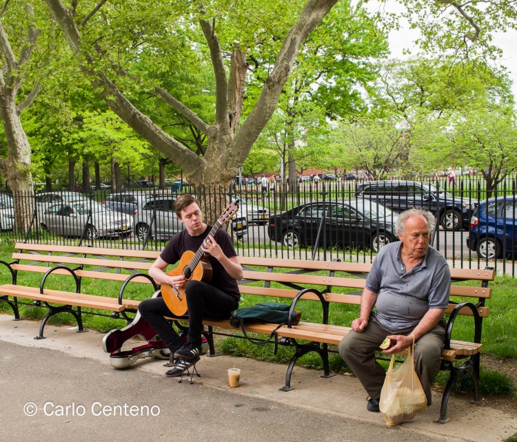
Tag: Observation
The Tree

Remnants v3

MOMA has a photography exhibit, appropriately, Ocean of Images: New Photography 2015. It runs through March 20 and I hope to plan an escape some weekend. It seems that each year, this exhibition—like others that explore trends and new artists in a given medium—brings out the opposing camps: “No, this isn’t photography” in one corner versus “Of course it is, it’s a new, fresh look at photography” in the other. Time marches on so change is inevitable, good or bad. For now, I take a look back.
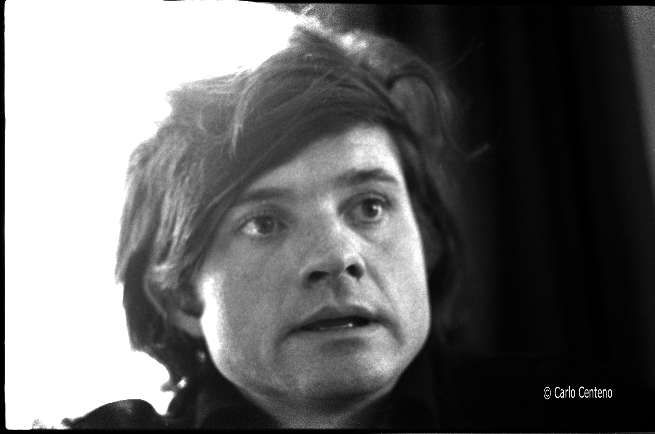
These B&W photos—like the ones in Remnant and Remnant v2 come from the same collection or year they were taken, which was sometime in 1973. I am particularly moved by this photo, a portrait of a teacher I had in high school. Mr. Dinsmore was his name. He had an emotional quotient [EQ] that was apparent long before EQ became a chapter in any number of business management books and case studies. First and foremost, he was a very good english literature teacher.

Sadly, I learned that Mr. Dinsmore passed away, a brain tumor taking him from the school and his charges. His spirit—and my memory of him—lives on.
Remnants v2
I love “time machines.” Old print ads, mechanical cameras and fountain pens, and of course, museums.
Coming across black & negatives and prints—especially those you haven’t seen in decades—is a journey all its own. I’m not waxing forlornly for the past, but I am revisiting these slices of time: what are the “whys” and “wheres” of these images?

Rainbow Connection
 If you’re curious, you’ll find my most recent post here.
Obsolete Film, Interesting Images

It doesn’t take a whole lot to keep me entertained. While on vacation I took some photos using outdated medium format film [120 Fuji NPH 400 color negative].

It is true that using film cameras can slow you down, but that’s not a bad thing if you want to slow things down a bit. Shooting medium format film—to me anyway—can be relaxing. I have to think, be immersed if you will, because everything is manually and mechanically accomplished: shutter speed, aperture, exposure, film advance, loading/unloading and so forth.

Call it nostalgia, but I get a lot of pleasure controlling my cameras versus having cameras control everything right up to when the shutter is pressed.

Using “obsolete” photo gear
 Of late I’ve been using an “obsolete” system and getting some incredible results. To wit:
- Hasselblad 553 ELX
- Zeiss Sonnar 150mm f/4.0 CF
- Imacon Ixpress V16 digital back
- Imacon Image Bank [tethered hard drive to back]
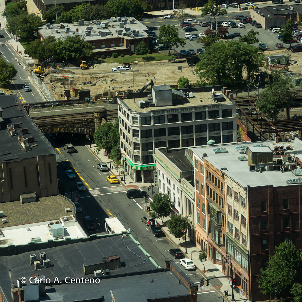
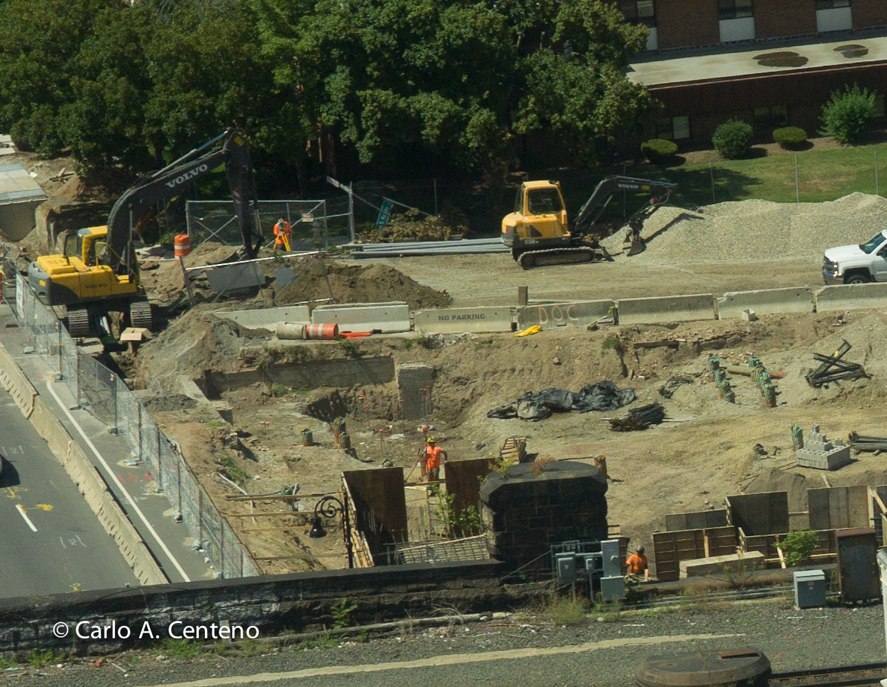 This photo is an enlargement of the top left-hand corner. I was checking for focus and didn’t realize the scale of magnification I was using in post production. I was astounded to say the least. [click on photos to enlarge] Can you read what’s written on the Jersey barrier? Can you see the name of the front loader on the left? Notice the pile of stones to the right of the frame…
Instant gratification

Earlier this month, I took out my Rolleiflex 6008 Pro and took a few photos using Polaroid 679 pack film. For those old enough to remember, Polaroids were frequently used to check exposure, light quality, composition, subject focus, depth of field and so on. These are but a few samples I took; in each case, the texture, the feel and ambiance of the image puts me in a calm state of mind.


A Marketing Department of One

Feeling Juxtapositions

Is it possible to look at a color or series of colors that can make you feel cool or warm? The red potatos and yellow onions above suggest warmth. But do you feel warm or warmer? Probably not. They’re too abstract in its context for feeling or suggesting warmth. Instead, you might be thinking more about lunch or dinner. Being food items, your appetite might trigger thoughts of eating. Granted, red and yellow are warm colors, but our interpretation covers a gamut of possibilities, all dependent on the subject at hand.

Autumn is my favorite season. There’s an inverse relationship between the colors red, yellow and orange and that of temperature. As the season progresses, those warm colors emerge, some in magnificent fashion, but the days—and nights—grow cooler. I look forward to both the color and the much cooler days and nights.
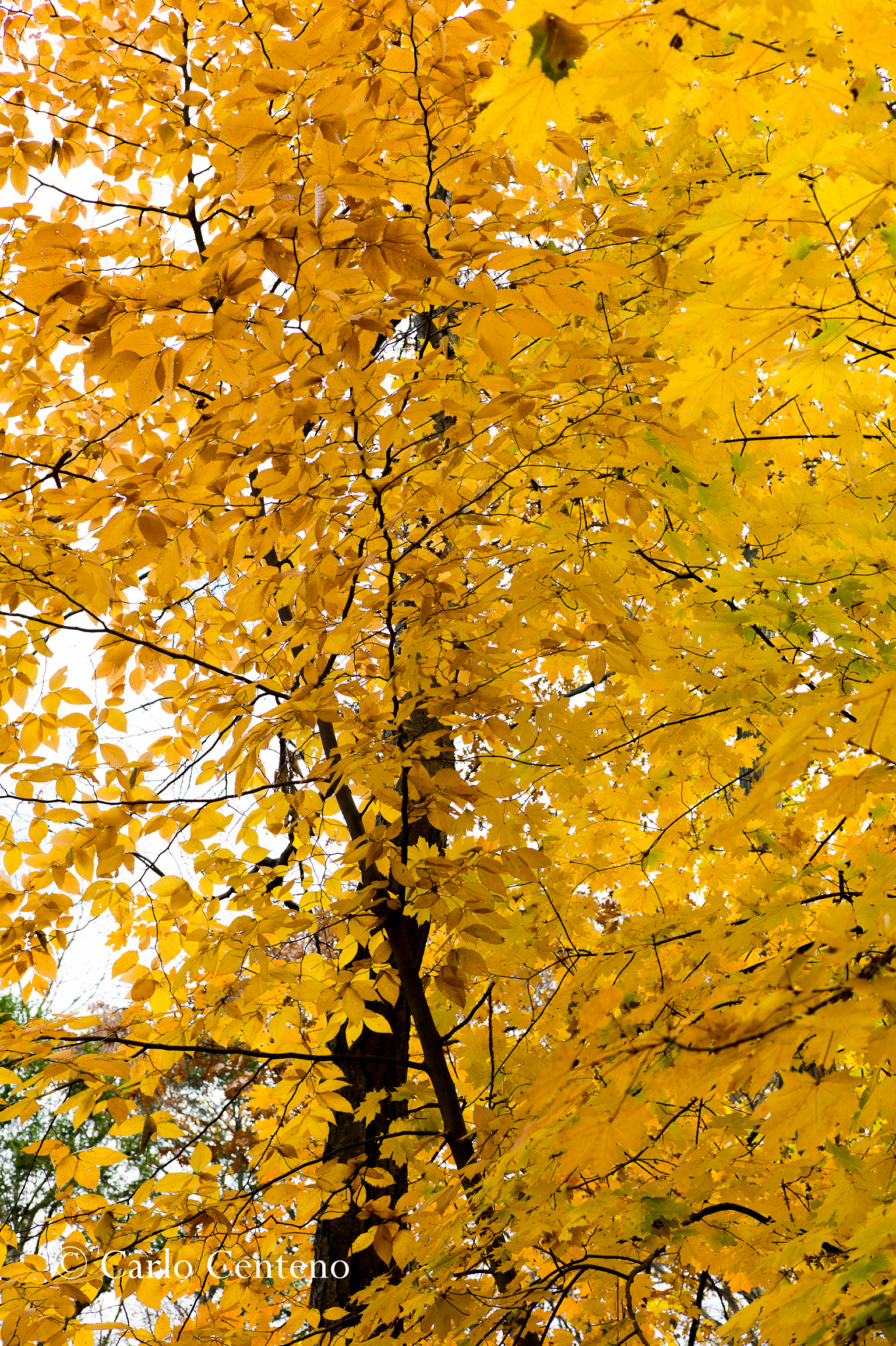
I like the juxtapositions presented this time of year.

I love Fall’s palette of color, often greatly enhanced like a center-stage spotlight when the sun is either rising or falling.

One thing you cannot ascertain from any of these images is just how cold it was when the shutter was clicked. The first image, naturally, was taken at an indoor market. The others offered not only the colors shown, but a range of temperatures from way-too-cold-for-this-time-of-the year to downright balmy and pleasant.
I love this time of year…
