Untitled

15 January-003
As much as I do like shooting digital, I admit a soft spot for all things analog. My roots are in film photography so that has something to do with all of this fascination for the old. I hope film never goes away; wishful thinking, but such is the march of technology. For now, wherever I can find film—some reasonably priced—then I’ll fetch a couple of rolls or so. Outdated film is fair game as they produce a different feel altogether. I think we get too hung up on histograms and color balance so much so that we dampen our feelings for what photography can bring to us.


15 January-002


With winter’s short days, I get pulled into the boldness of both light and shadow. And when the weather is just uncooperative—really windy, extremely cold, etc.—I’ll get involved with film, a light meter, a medium format camera and sometimes a tripod. 

15 January-006


15 January-005

Chasing the Light v2

12 NewOffice 21mm BW1-24-2012-1000226


12 NewOffice 21mm BW1-24-2012-1000230


From another vantage point—in this case 25 floors up—light takes on a whole new feeling. Chasing the light from a high-rise slows me down because of all the details in front of me: the buildings, the shadows, the roads, the tracks, the river, the moving cars, etc. etc. etc. You can’t help but take your time scanning the vista in front of you. I took these in the late afternoon during a break from my desk and drudgery. They say getting light—outdoor light that is—is good for you.

I agree.

Winter: The four seasons’ “bad” brand?

14 Feb Storm-1145From saturated colors, to shades of grey, that’s one way to describe the transition of Autumn to Winter. Of the four seasons, winter often gets a bad rap. As a brand, winter’s attributes of bone-chilling cold, freezing rain, sleet, burst water pipes, vehicles that won’t start, cancellations [schools, meetings, performances, transportation, e.g.] among others play into that season’s unfair position or perception. Our modern way of living has made us unhardy if not too soft for nature’s rigorous character made evident in the months of November through March.

14 Feb Storm-1148Winter needs some repositioning [or reminding] of its more positive attributes. And there are such attributes, which if we are honest amongst ourselves would certainly concur that, indeed, these qualities are demonstrably acceptable. Such qualities can be nurturing, calming, relaxing and invigorating. All this on any given day in winter. For me, all those qualities or characteristics manifest during and after a major snowfall.

14 Feb Storm-1155I have fond memories of winters past. Ski trips, sled runs, hikes into the forest, walks with my family. In this blanket of quiet and stillness, I derive a prana that matches that of an ocean breeze on a sun-draped beach. How can that be? Think yin and yang. Consider polar opposites and how without one, the other won’t exist. Yin and yang coexist. I find a personal harmony in winter more so than any other season [fall is a very close second, actually].

14 Feb Storm-2-1158

Snow and cold act like acoustic panels whereby irrelevant sounds don’t surround or even reach me. Horns, revving engines at stop lights, really loud music escaping open car windows, none touch a calm within me. As the snow piles up, the world becomes monochrome with a color I feel as “equilibrium grey.” This equilibrium can be so complete that it’s only failing is the glow emitted from street signs, traffic signals and reflective panels. All else is in the domain of snow. Every now and then I read about cleansing diets and I’ve heard that they can be very beneficial for one’s general health. Winter has a cleansing attribute. Its stillness points us to a calm; its quiet to a inimitable level of solitude. The expanse of snow covers the landscape, in effect hiding from us things that aren’t positive, while protecting those things that are.

Yes, there several good qualities about winter…

Feeling Juxtapositions

14 Fall Yel+Red-1004363

Is it possible to look at a color or series of colors that can make you feel cool or warm? The red potatos and yellow onions above suggest warmth. But do you feel warm or warmer? Probably not. They’re too abstract in its context for feeling or suggesting warmth. Instead, you might be thinking more about lunch or dinner. Being food items, your appetite might trigger thoughts of eating. Granted, red and yellow are warm colors, but our interpretation covers a gamut of possibilities, all dependent on the subject at hand.

14 Fall Yel+Red-1004378

Autumn is my favorite season. There’s an inverse relationship between the colors red, yellow and orange and that of temperature. As the season progresses, those warm colors emerge, some in magnificent fashion, but the days—and nights—grow cooler. I look forward to both the color and the much cooler days and nights.

14 Fall Yel+Red-1004380


I like the juxtapositions presented this time of year.

13 Oct-1002689

I love Fall’s palette of color, often greatly enhanced like a center-stage spotlight when the sun is either rising or falling.


13 Oct-1002695

One thing you cannot ascertain from any of these images is just how cold it was when the shutter was clicked. The first image, naturally, was taken at an indoor market. The others offered not only the colors shown, but a range of temperatures from way-too-cold-for-this-time-of-the year to downright balmy and pleasant.

I love this time of year…


The Art of Viewing Art


14 Clarke-1004066Some experts would have you believe that the absolute best way to view art, specifically flat works of art, is from a specific distance and at a specific angle. But there’s more to it than that. The shape, the color[s], the physical size, the subject at hand are a few among other qualities that shape our personal perception of whatever it is we’re looking at. While a 20-foot tall tapestry can express its grandeur at a distance, I’m more intrigued if not fascinated by the handiwork in its creation. I tend to move rather close to such objects in wonderment of the details and the craftsmanship involved.14 Clarke-1004074The exhibits at a museum, whether curated for a specific event or presention, or shown as part of a permanent collection, are nothing more than merchandise on display. I don’t want that comment to come off as something crass. I’m merely distilling this type of marketing in a simple form, commercial though it seems.  Though this may be an oversimplification, compare the engagement to that of a department store. Consider a well-done display of business clothing or outdoor, adventure products. The items on display either spark your interest or do nothing at all. Much depends on what piques your attention and curiousity.14 Clarke-1004072But unlike the department store, we don’t produce our charge cards to aquire a canvas we sense could do something to a room that needs freshening up. Instead what we should do is open our sense of feeling and seeing. What stirs inside us? Does it feel visceral? Is it calming? Does it provoke agitation, confusion or consternation? Does it do anything at all?14 Clarke-1004073

What I can’t describe to anyone reading or viewing this post is the exact physical, literal details about the art: the weight of the paint, the roughness of a brush stroke, the depth of detail that borders 3-dimensional perception. As much as we’d like to say that we know a bit about everything and a lot more about something specific, that knowledge or memory cannot replace being physically in front of the art work.14 Clarke-1004075

When I see something on an Apple Retina display, I’m duly impressed with the detail and richness of color. And as nice as that is, the experience cannot replace being right there next to the object or being in front of a vista or being enveloped by the ambiance and a sense of place.14 Clarke-1004069

Perhaps this post should be retitled, What do you feel when you look at Art?

Training to be happy, or, Does your bank account size matter?

In the November 10th issue of the Wall Street Journal was an article, Can Money Buy Happiness? I’m referencing the print edition though as most would know, you can find the article online [I’ve linked it in the first sentence]. The article doesn’t offer any real surprises; I found no epiphanies in the story. I did however, analyze my own sense of personal happiness. Perhaps because of my age, I’m seeing a closer link to happiness through the relationships I have as opposed to wanting for things I don’t have.

Brooklyn 6-23-2013-1002221


So, what then, can I proffer in the guise of enlightenment? Here’s my short list:

  • What you have in your bank account is important, but the greater question is, what do you intend to do with it? I won’t disagree that having a lot of expendable money can be very nice, but money, like things, has an emphemeral quality.
  • Personal happiness must start with yourself. Self-evident, but I think we underestimate our own value, or own physical and emotional net-worth. In our age of “Reality TV,” celebrity adulation and toxic levels of narcissism , comparisons are inevitable. Other folks appear to be happier than me. Remember that apperances can be deceiving.
  • Training yourself to be happy [for me] starts and ends with a blessing. I think of so many who really cannot count on what I have: my health, my mobility, the use of all my senses, a roof over my head, 3 meals a day [often more], my friends, my family, a good sense of the person that I am or have come to be.
  • The accumulation of possessions will inevitably either go static or possess its owners, even both. If you pursue material things, by the time you get to your nth handbag, pair of shoes, latest digital device, fancy watch, or what have you, all the other prior possessions of similar ilk will spend more time dormant, even forgotten, in boxes within a drawer among other things also delegated to second [or third, fourth], place.

14 Grover CR 6-21-1003945


Whenever I get caught up in comparisons, or wanting to get something to increase my happiness, I think of this guy. We all should be more childlike; all too often, we’re just plain childish. Life should be, can be, much simplier and thus happier.

Grey is Beautiful

As far as I can remember, B&W images have held my imagination firmly, yet inspirationally. Perhaps it’s how my brain’s wired, or the fact that my wired brain is getting older and thus prone to moments of unusual clarity. Maybe it’s about oxygen loss, electrolyte loss or that i’m just losing my mind.

14 Clarke-BW-1004065Of late I’m remembering things in B&W, photographically speaking. Faces, places, things and so forth. If I close my eyes and remember an important event, more often than not I believe I can see the memory more clearly if it is, indeed, framed in B&W. I have no scientific explanation or simple rationale as to why, but such is the case. It doesn’t always happen, but when it does, I take notice.09-723 London-BW-2

Don’t start thinking that this brief treatise is about black and white being “more real” than color. That’s a tired argument made more exhausting when I’m among other photogs who present their case without first having the benefit of a glass of wine or beer…or both.

BW Chairs 2011 (1 of 1)

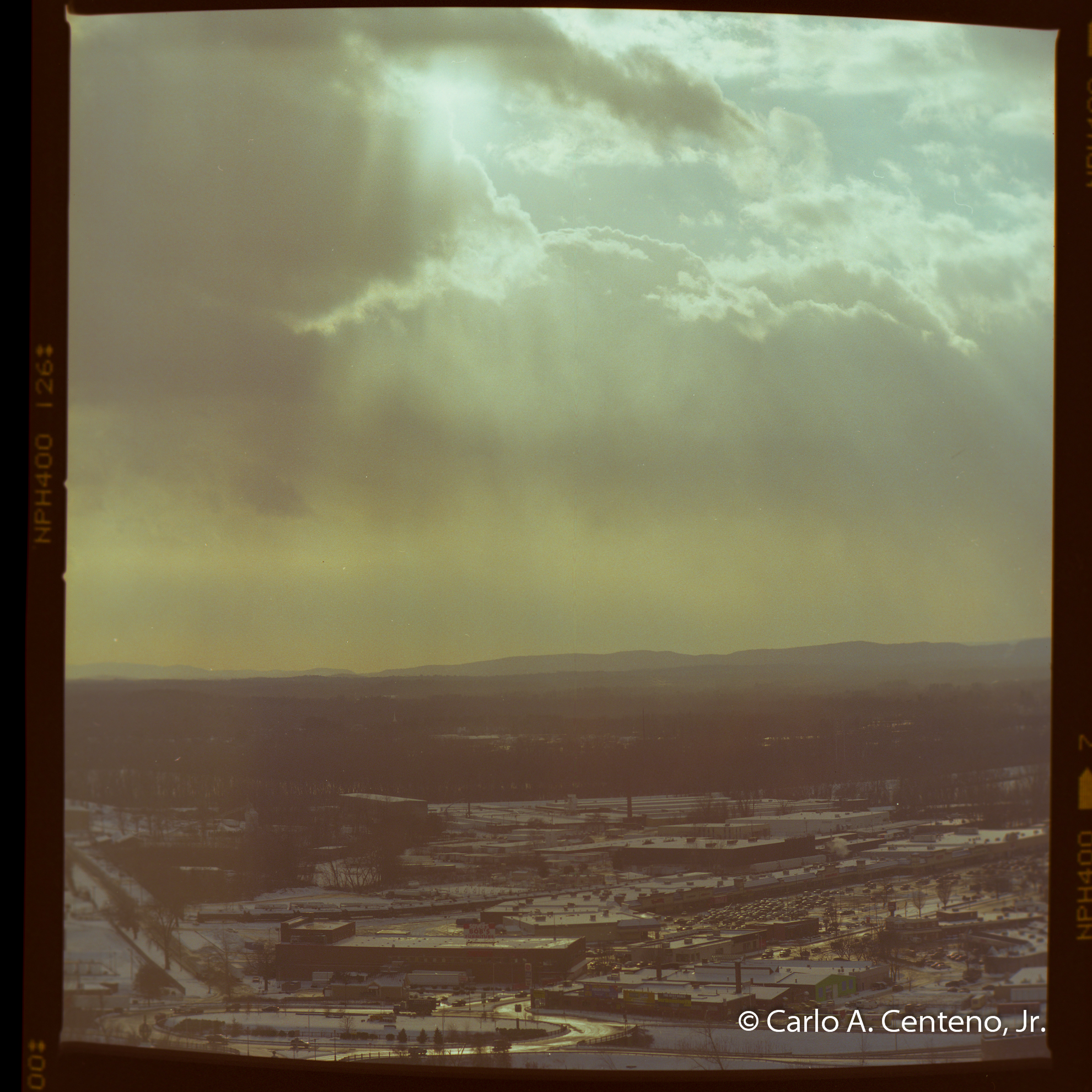
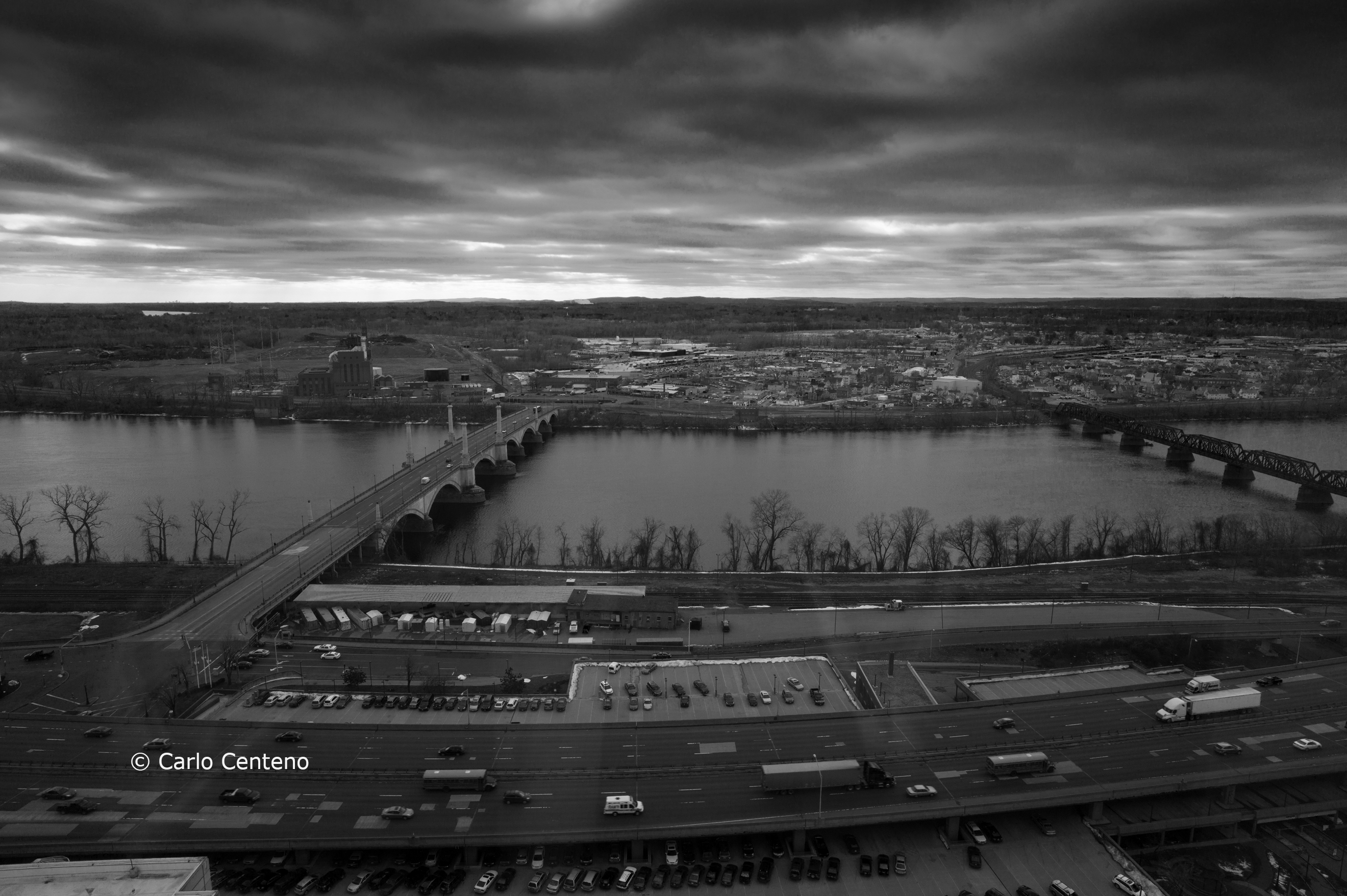
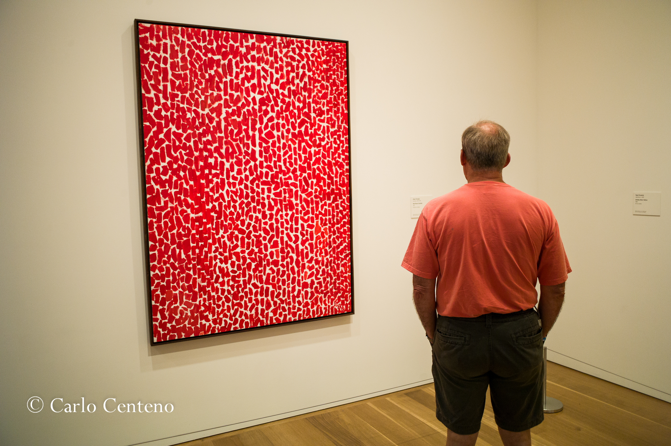
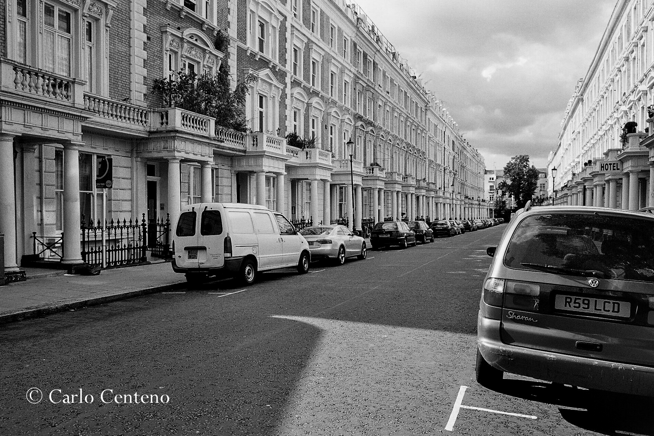
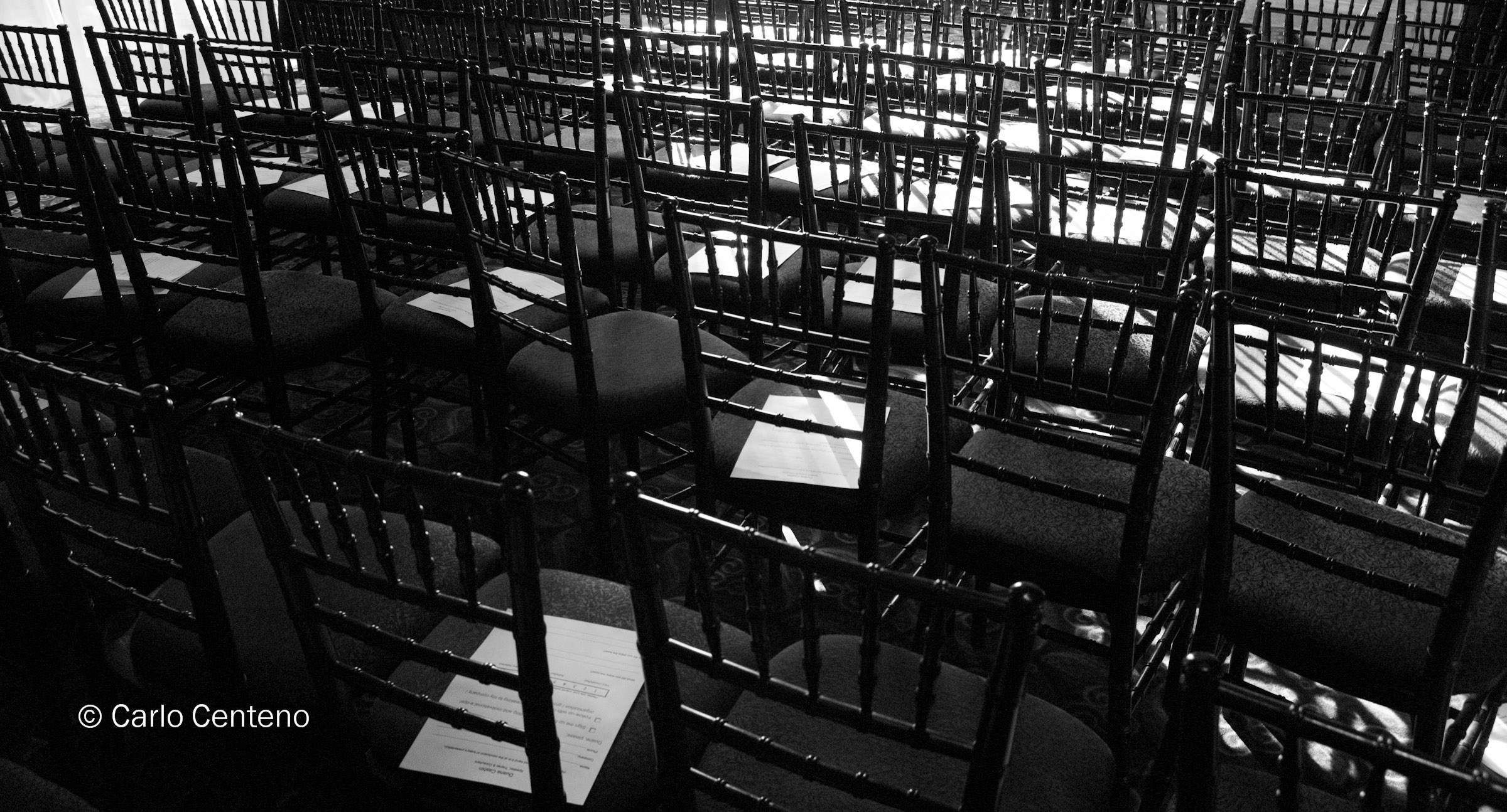
Grey in all its incomparable shades, levels of intensity and density and luminance, is a wonderously beautiful color.  To me, none of it is boring or trite or conveniently familiar. I embrace the liberty that black and white gives me; everything in front of me is unified. The brigthness or darkness provides the lightness and weight respectively of whatever subject is before you.

The photography of Elliott Erwitt—in particular his series on dogs—is unabashedly “light” in nature. Eisenstadt’s iconic image of sailor-kssing-nurse-in-Times Square becomes a beautiful expression of unbridled joy. Ralph Gibson’s images from his collection, Somnabulist, is a journey alongside light’s texture. Yes, there’s texture from the subjects in his images, but you can feel the intensity of his grey scale, an intensity that pushes one’s comfortable notion of contrast, modeling and depth to another level. Cliche sounding? Yes, but you can prove it to yourself by allowing yourself a different POV. For me, no discussion is complete without mentioning the grandfather of Grey as something beautiful: Ansel Adams. Whether it’s a postcard-sized image or a 30×40-inch print, there’s no denying an evocative appreciation of his creativity and understanding of how he feels for what’s in front of him!

13 Rockaways-1002533

Most of all, I sense that grey gives me an empirical appreciation of my life to date. Here’s what I mean: B&W and all its shades of grey acts as an emotional filter, allowing my most genuine feelings to surface. I can safely feel—whatever such feelings might be—at a “safe distance” yet feel a sense of inclusion, maybe even a connection, with the subject at hand. Remember that “subject’ doesn’t necessarily mean what’s tangible in front of you, but a quality that rises from your persona or sense of self.

I’m taken by grey. It’s so beautiful to me…

Personal Branding & a Jellyfish

Noted marine biologist, Edith Widder, Ph.D. has spent much of her life under water. She has in fact devoted her professional energy to creatures living in oceans so deep that the light of day will never reach them. On November 23, Dr. Widder will be giving a talk, open to the public, about her work on bioluminescence and marine life. I’m looking forward to it for a variety of reasons not the least being my curiosity and fascination for things different.Bioluminescence-1

copyright Edith Widder


This photo is a good example of what she studies, specifically, bioluminescence. It’s that unique ability to generate light, light as the result of chemical reactions inside the organism. On the one hand, you have the image on the right side of the frame. It shows the jellyfish as it appears under natural light. The image on the left is the same animal but in suroundings totally devoid of light.

The point I’m getting to is this: is your personal brand consistent across work environments? Does it change in any way, and if so, is the change pronounced enough to be noticed? Think of mannerisms [behavior and comments] and appearance [attire and grooming].

I suspect that under extreme conditions, some people undergo changes that could leave others scratching their head. “When did he decide to wear really nice-looking suits?”  However, for most of us, we don’t so much change our personal brand as much as we do tweaking it. We dial in some adjustments to reinforce an attribute or suggest another. A long time ago, I read somewhere—and it probably came from an Italian designer—that three things signal a person’s sense of accomplishment, confidence and purpose: a wristwatch, shoes and writing instrument.  Interesting.

Regarding wristwatches, using mechanical watches—either hand wound or self-winding, reinforces to an erudite observer that the wearer has a sense about time’s importance. Mechanical watches require attention. A nice [Swiss, German, e.g.] automatic watch represents a high level of skill and expertise in watchmaking. Costs aside, I like to think that the wearer of such accessories has an awareness and appreciation for fine watchmaking. The same can be said of the other 2 items. A good pen—especially a fountain pen—speaks volumes about the user. And like the automatic wristwatch, observations cover both positive [learned, confident, assured, accomplished, e.g.] and negative [flashy, poor use of money, attention seeker, pretentious, e.g.]. I don’t think I need to elaborate on footwear at this point.

So then, what aspects of your personal brand are you fine tuning? Are the adjustments or changes subtle or dramatic in their expression….like our jellyfish?