In the November 10th issue of the Wall Street Journal was an article, Can Money Buy Happiness? I’m referencing the print edition though as most would know, you can find the article online [I’ve linked it in the first sentence]. The article doesn’t offer any real surprises; I found no epiphanies in the story. I did however, analyze my own sense of personal happiness. Perhaps because of my age, I’m seeing a closer link to happiness through the relationships I have as opposed to wanting for things I don’t have.

So, what then, can I proffer in the guise of enlightenment? Here’s my short list:
- What you have in your bank account is important, but the greater question is, what do you intend to do with it? I won’t disagree that having a lot of expendable money can be very nice, but money, like things, has an emphemeral quality.
- Personal happiness must start with yourself. Self-evident, but I think we underestimate our own value, or own physical and emotional net-worth. In our age of “Reality TV,” celebrity adulation and toxic levels of narcissism , comparisons are inevitable. Other folks appear to be happier than me. Remember that apperances can be deceiving.
- Training yourself to be happy [for me] starts and ends with a blessing. I think of so many who really cannot count on what I have: my health, my mobility, the use of all my senses, a roof over my head, 3 meals a day [often more], my friends, my family, a good sense of the person that I am or have come to be.
- The accumulation of possessions will inevitably either go static or possess its owners, even both. If you pursue material things, by the time you get to your nth handbag, pair of shoes, latest digital device, fancy watch, or what have you, all the other prior possessions of similar ilk will spend more time dormant, even forgotten, in boxes within a drawer among other things also delegated to second [or third, fourth], place.

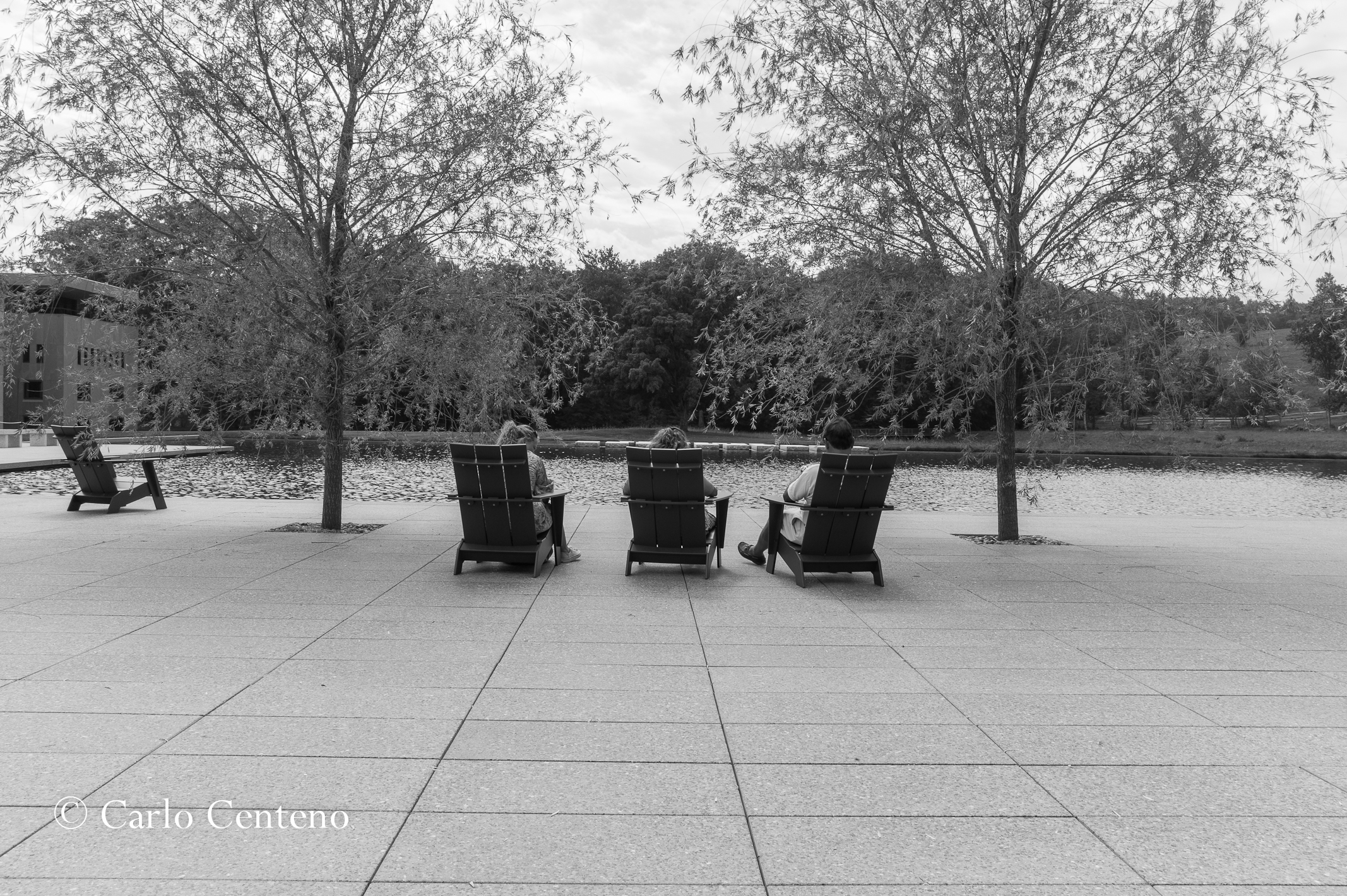
Whenever I get caught up in comparisons, or wanting to get something to increase my happiness, I think of this guy. We all should be more childlike; all too often, we’re just plain childish. Life should be, can be, much simplier and thus happier.