


With a pen and camera
 Ferrari. What comes to mind other than the obvious. Luxury? Exclusivity? Formula 1? Art? Engineering? History? Passion and Soul? You can add your own to the list. For as long as I can remember, I’ve felt that many things designed and made in Italy were objects in possession of a soul. From appliances, cuisine and fashion to industrial design, mechanical engineering and art, Italy’s portfolio of world-renowned brands are the stuff of dreams and much more. However, there is one brand that has an aura all its own, one that’s genuinely global in scale and scope.
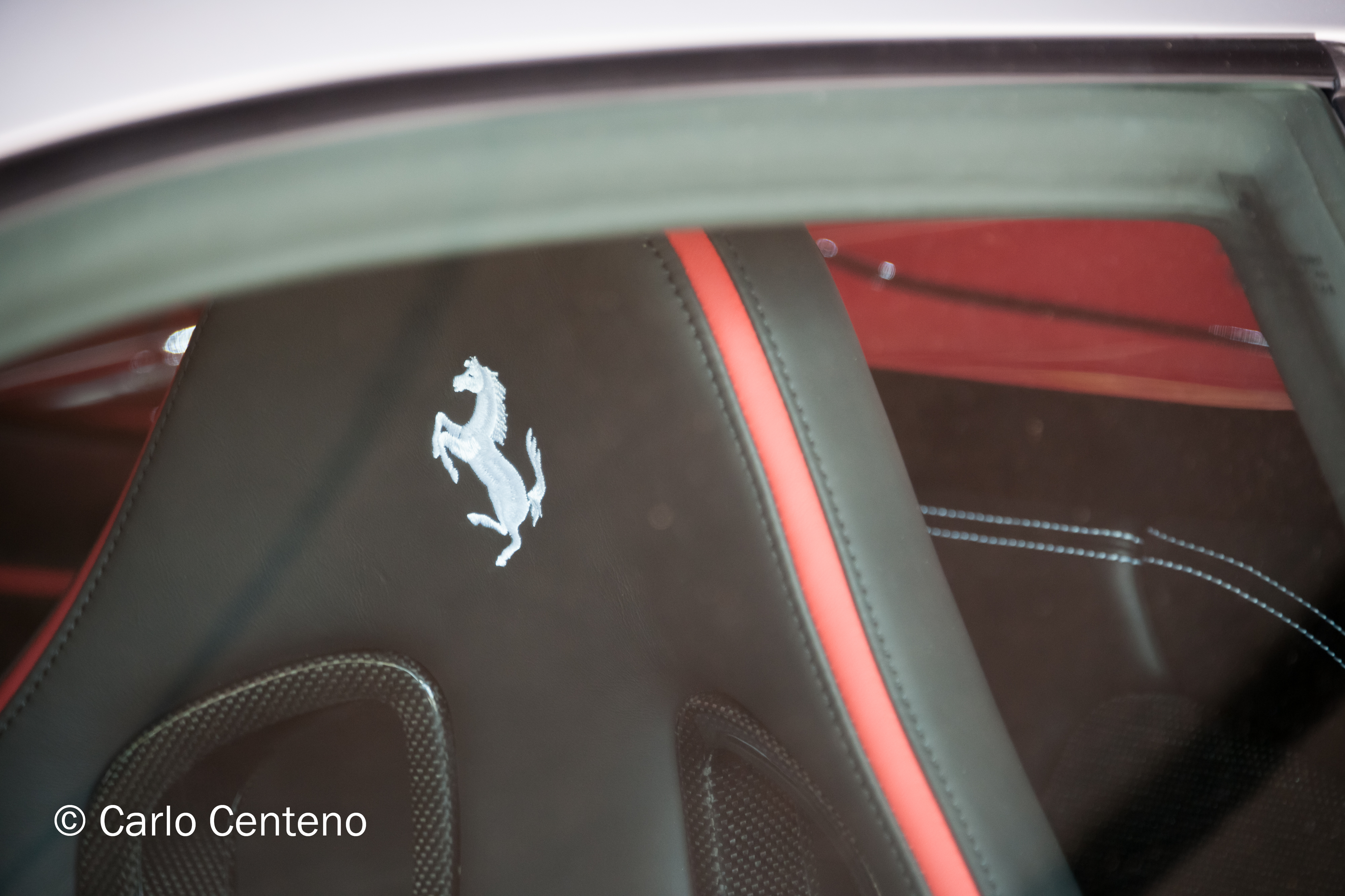
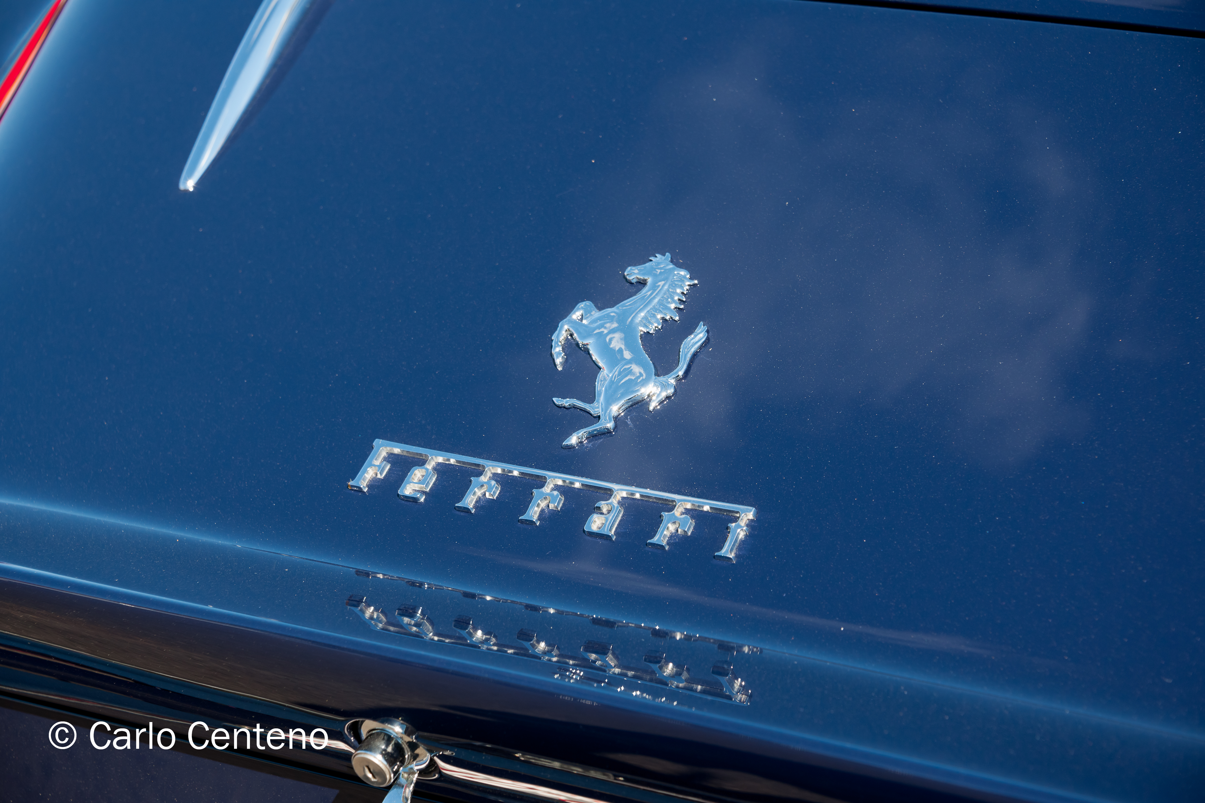
Between the poles and across the hemispheres, no other brand stirs as much passion, approval, loyalty and emotional ownership. When Enzo Ferrari created his eponymous company, he put into motion more than a company. Ambition, passion, problem-solving and yes, art, were made manifest in his cars, first in racing, then in street-legal sports and GT cars.

What factors played into the creation of Ferrari, the brand?
Passion This is a must-have, a non-negotiable intangible that’s expressed in determination, faith in oneself, desire and ambition.
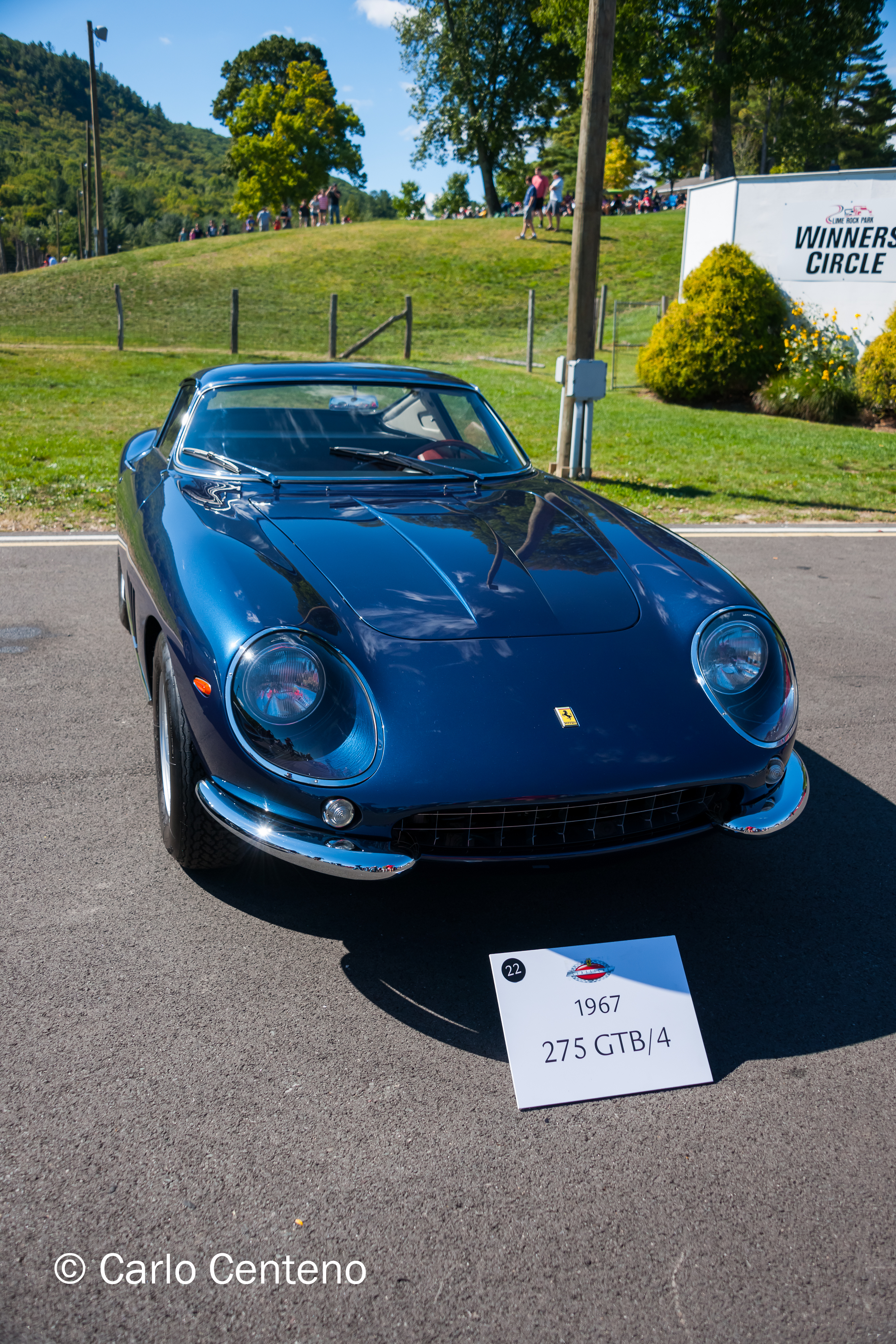
History There are no overnight successes. Powerful brands have a narrative. Properly framed [read: small beginnings to small victories to world-wide success], Ferrari took to heart his mission to produce race cars that were designed to win AND deliver an aesthetic unlike others on the track. Certainly this mission carried over to street cars. Ferrari’s history is important to the brand’s mystique and attractiveness; the company smartly uses history to enhance its position in the exotic car market.
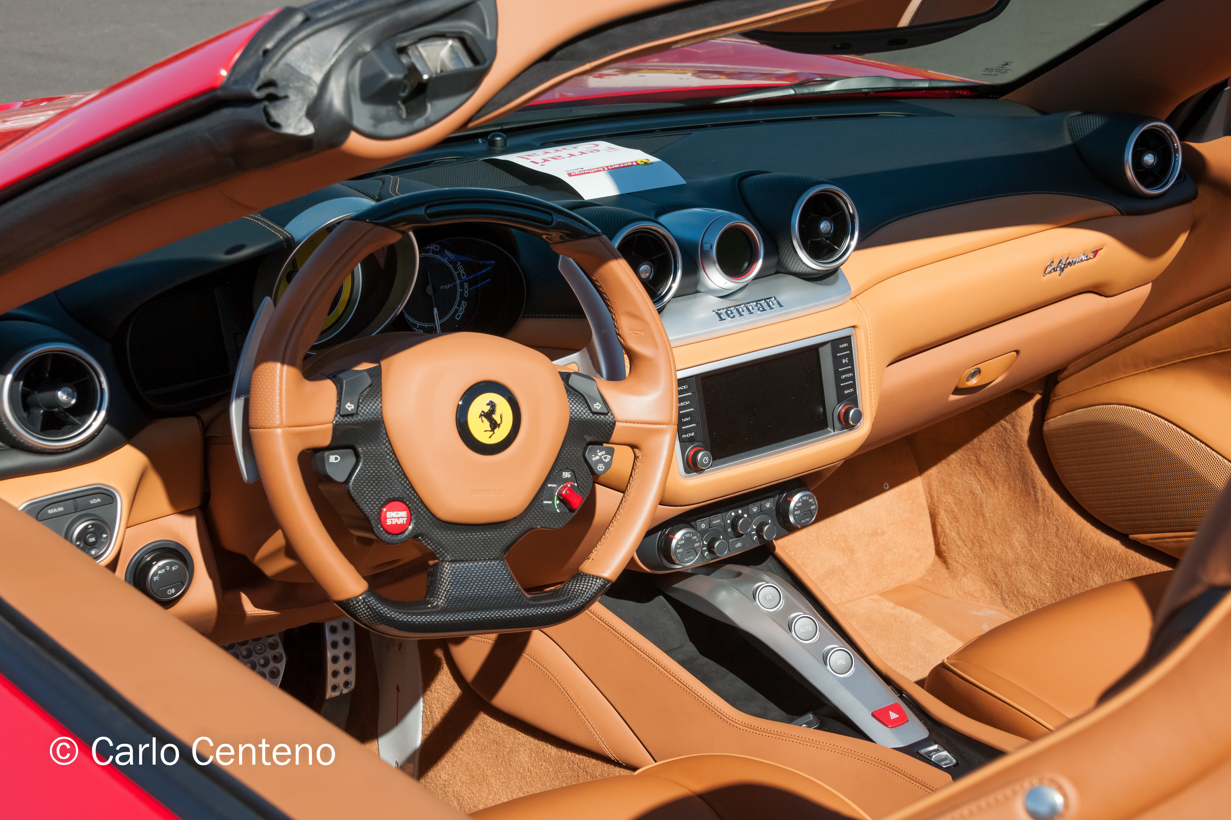
Standing Out Powerful brands deliver consistency and a promise on quality. Not to be flip, but early on, Ferraris weren’t consistent with quality and reliability. However that has changed. In just the past 20 years, they’ve produced products that are wholly different from other sports cars. One thing is certain, when you see a Ferrari, it does stand out. If you’re fortunate to drive one, its performance also stands out across a variety of areas [acceleration, braking, steering, sounds from the engine bay and exhaust pipes and so on]. Proper positioning is part of standing out and the company manages this extremely well.
Value You can successfully argue that no one needs a Ferrari [or anything that speaks of luxury, for that matter]. The brand’s real value goes beyond the sticker. Emotional ownership and exclusivity fuels value; the sticker price reinforces limited production quantities as well. Ferrari markets its brand through careful licensing, merchandising, events and affiliations. Put another way, mortals like us can still feel part of the Ferrari brand, mystic and experience. Their online store demonstrates this because it promotes a sense of inclusion: we can’t afford the cars, but we can feel and show our admiration for the brand via jackets, bas, mugs, watches, caps, T-shirts, office accessories and more.


It is the night
My body’s weak
I’m on the run
No time to sleep
I’ve got to ride
Ride like the wind
To be free again.
Christopher Cross

When you encounter a vista, or even a myriad of details that are attached to work [read: deadlines, projects, concurrent goals, e.g.], what do you see?

Everything is subjective when it comes to expressing oneself with a painting, a short story, and a photograph. I know I’ve missed a few other examples, but I listed the aforementioned for expediency.

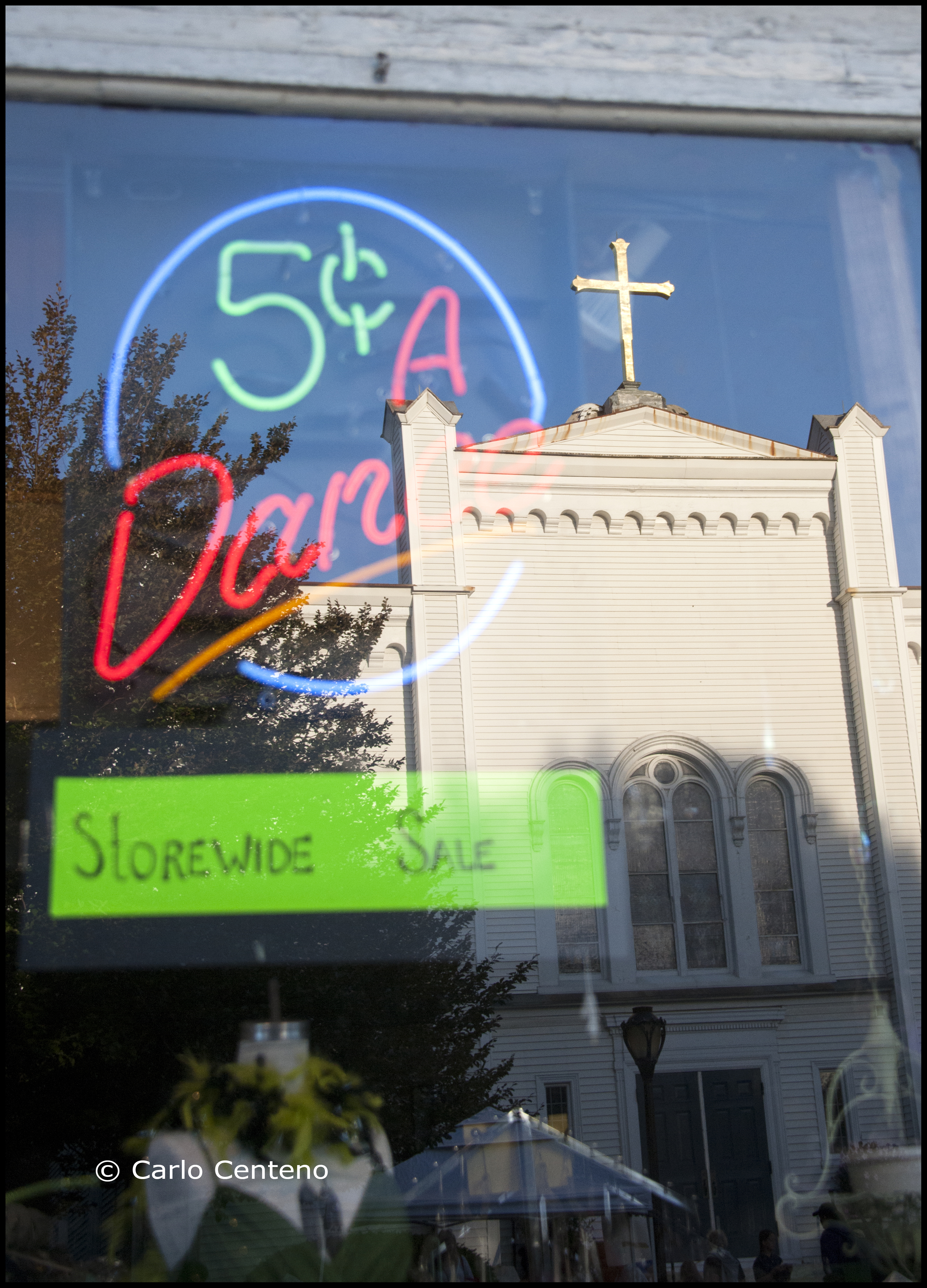
Whether you’re taking a picture, painting a landscape or creating a marketing communication plan, sometimes we can’t see the forest for the trees, and on other occasions, every nuance, every detail and purpose comes into clear focus.
While it matters where you’re looking, other times what matters more is what you are “seeing.”


These 2 photographs were taken before many millennials were born. They were taken with a Nikon F with a Nikkor 50mm f/1.4, using TRI-X film 400, sometime in the fall of 1973. I suspect that these 2 views are probably different today, and I dare not visit the space for fear that in their place will be condos or parkways or other concrete manifestations that tend to mute my sense of self.

Is it possible to look at a color or series of colors that can make you feel cool or warm? The red potatos and yellow onions above suggest warmth. But do you feel warm or warmer? Probably not. They’re too abstract in its context for feeling or suggesting warmth. Instead, you might be thinking more about lunch or dinner. Being food items, your appetite might trigger thoughts of eating. Granted, red and yellow are warm colors, but our interpretation covers a gamut of possibilities, all dependent on the subject at hand.

Autumn is my favorite season. There’s an inverse relationship between the colors red, yellow and orange and that of temperature. As the season progresses, those warm colors emerge, some in magnificent fashion, but the days—and nights—grow cooler. I look forward to both the color and the much cooler days and nights.

I like the juxtapositions presented this time of year.

I love Fall’s palette of color, often greatly enhanced like a center-stage spotlight when the sun is either rising or falling.

One thing you cannot ascertain from any of these images is just how cold it was when the shutter was clicked. The first image, naturally, was taken at an indoor market. The others offered not only the colors shown, but a range of temperatures from way-too-cold-for-this-time-of-the year to downright balmy and pleasant.
I love this time of year…
