
With a pen and camera
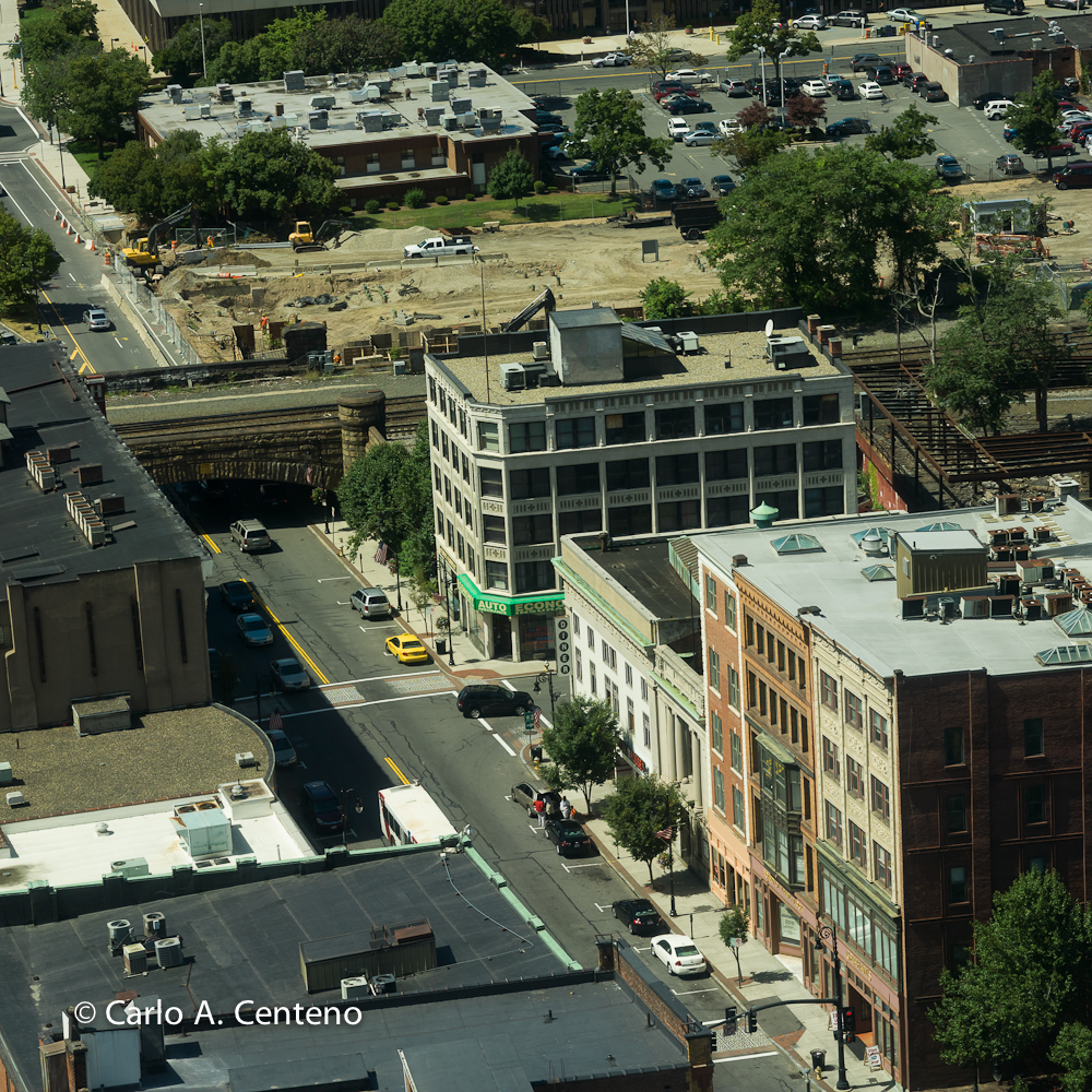 Of late I’ve been using an “obsolete” system and getting some incredible results. To wit:
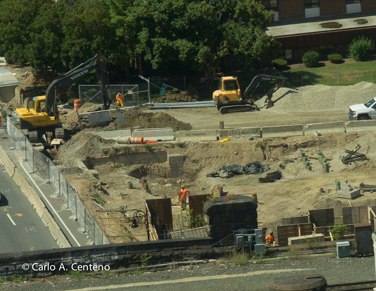 This photo is an enlargement of the top left-hand corner. I was checking for focus and didn’t realize the scale of magnification I was using in post production. I was astounded to say the least. [click on photos to enlarge] Can you read what’s written on the Jersey barrier? Can you see the name of the front loader on the left? Notice the pile of stones to the right of the frame…

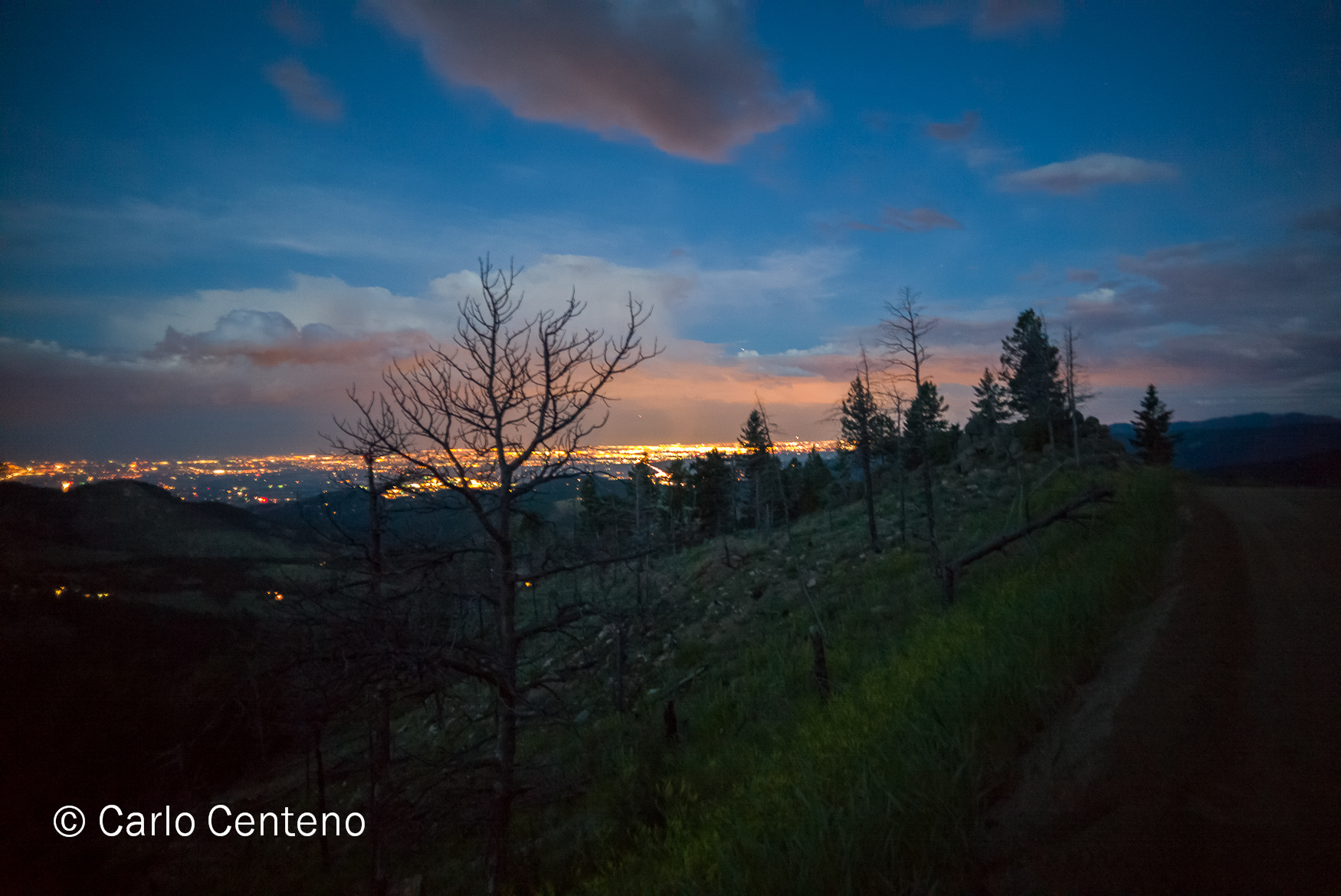
Nostalgia has a way of displacing your sense of place—physically, emotionally, even spiritually. We recently returned from Colorado visiting our daughter and her boyfriend. It was our first time in Colorado. I now have a better understanding of why those 2 love it out there. You encounter beautiful scenery, a lot of open spaces, a more relaxed pace of living and so forth. For the most part, 95% of why we wanted to go was to see our kid [no longer a “kid” I might add]. If she was flung further, we’d still find the means to visit her.
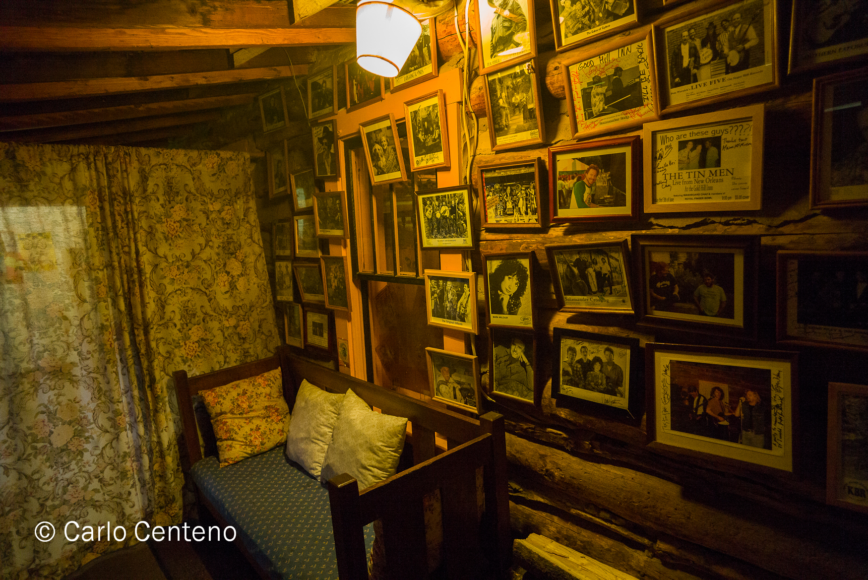
The Gold Hill Inn had a strong pull for me. Specifically the place harkened to a time when you knew most of the townsfolk by name, offered a greeting [mornin’ ma’am] and rarely took for granted what was in front of you. Here was an old mining town and an inn that held no pretense. What you see is what you get, as they say. Conversation you might have overheard was direct and nothing of the dialect we hear or read about in media, whether broadcast, print or electronic.
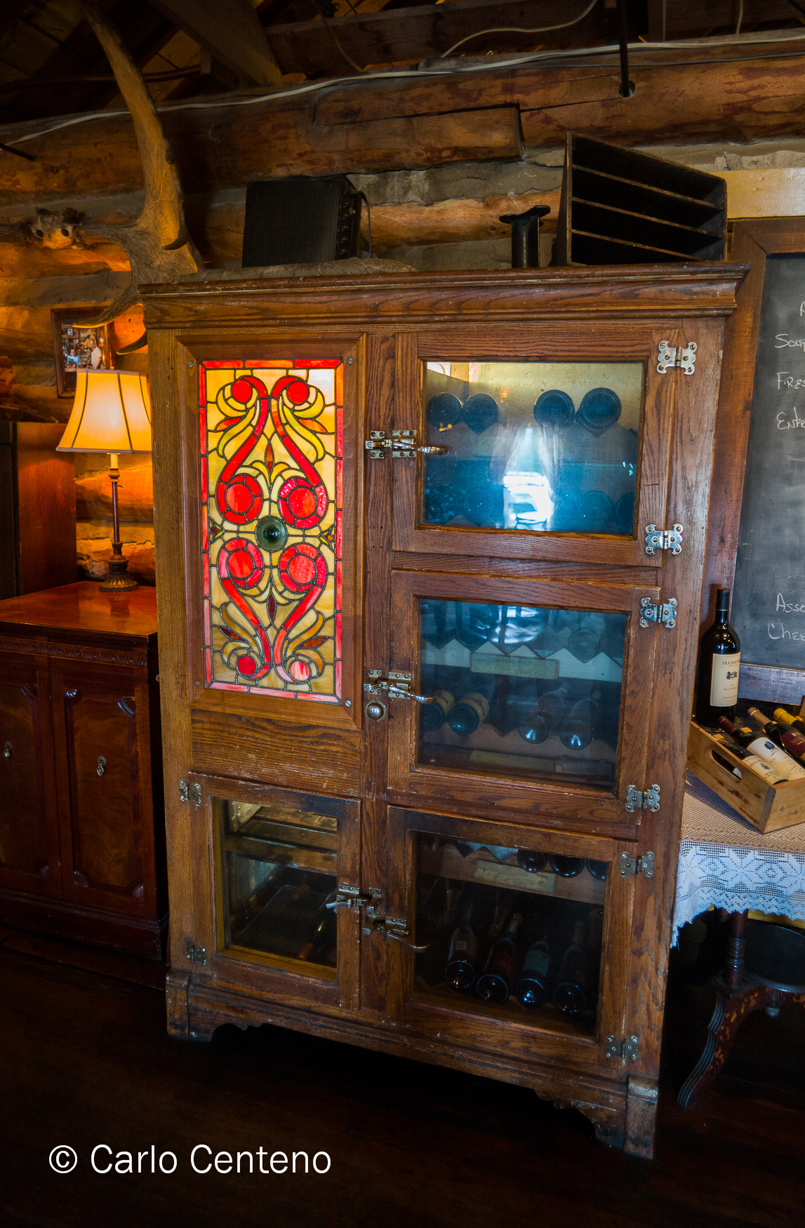 Aside from the obvious modern conveniences of electricity, telephone, running hot and cold water and bathrooms, you can see, smell and hear the straightforward attributes of the time. The wine cabinet looked sturdily built and beautiful to look at. The National Cash Register, while obsolete, still proudly showed off its utility and independence; it required no electrical power but the firm hand of the bartender. No LCDs or CRTs here, thank you. And you better have strong hands and fingers to manipulate the keys and drawer of this handsome machine. And directly above that cash register, what better contrast than the nude portrait positioned just so, as if recumbent on the edge of that register. The fecund suggestions in both portrait and cash register shouldn’t be lost on anyone. Strength, abundance, beauty, even mindfulness, all expressed in just those 2 objects.
The floorboards were just that: a floor made out of wood, perhaps oak or another type of hardwood. When you walked on it, you felt its idiosyncracies. Not all the planks lay perfectly flat, some joints stood higher or lower than the one adjacent. If you happen to wear boots—especially cowboy boots—the firm, “thud” of a heel made known to all that you weren’t innocuous or at least couldn’t be. Try as you might, you can’t ignore that heavy sound on the floor; your natural reaction was to look over to see who was there. Old, young, man or woman, the “thud” sounded and felt the same.  In its simplest form, the declarative sentiment nostalgia often gives to us is, “How much more do you need?” Today, “want” versus “need” often precedes more. All the fundamentals of life are laid bare in this town. Aesthete is in the eye [and pocketbook] of the beholder, but standing in that town, in that room, on main street with an open mind and unhurried cadence only enhanced the value of what was genuine. What you see is what you get, indeed, but sometimes I need perspective on what I already have.
“Nobody knows the trouble I’ve seen….” and so goes the opening chorus of a popular spiritual song, which, in light of this year’s winter snow, feels appropo. I can’t remember a time when so much cold and snow visited our fair states. Substitute “winter” for “trouble” in the opening line and you can get a good sense of what burdens the lot of us. The quantity of snow has wreaked havoc on just about everything, and I mean everything.
But, all is not lost. This past weekend, scores of winter-weary New Englanders flocked to Smith College to soak in the colors, aromas and textures of the annual flower show. To wit:
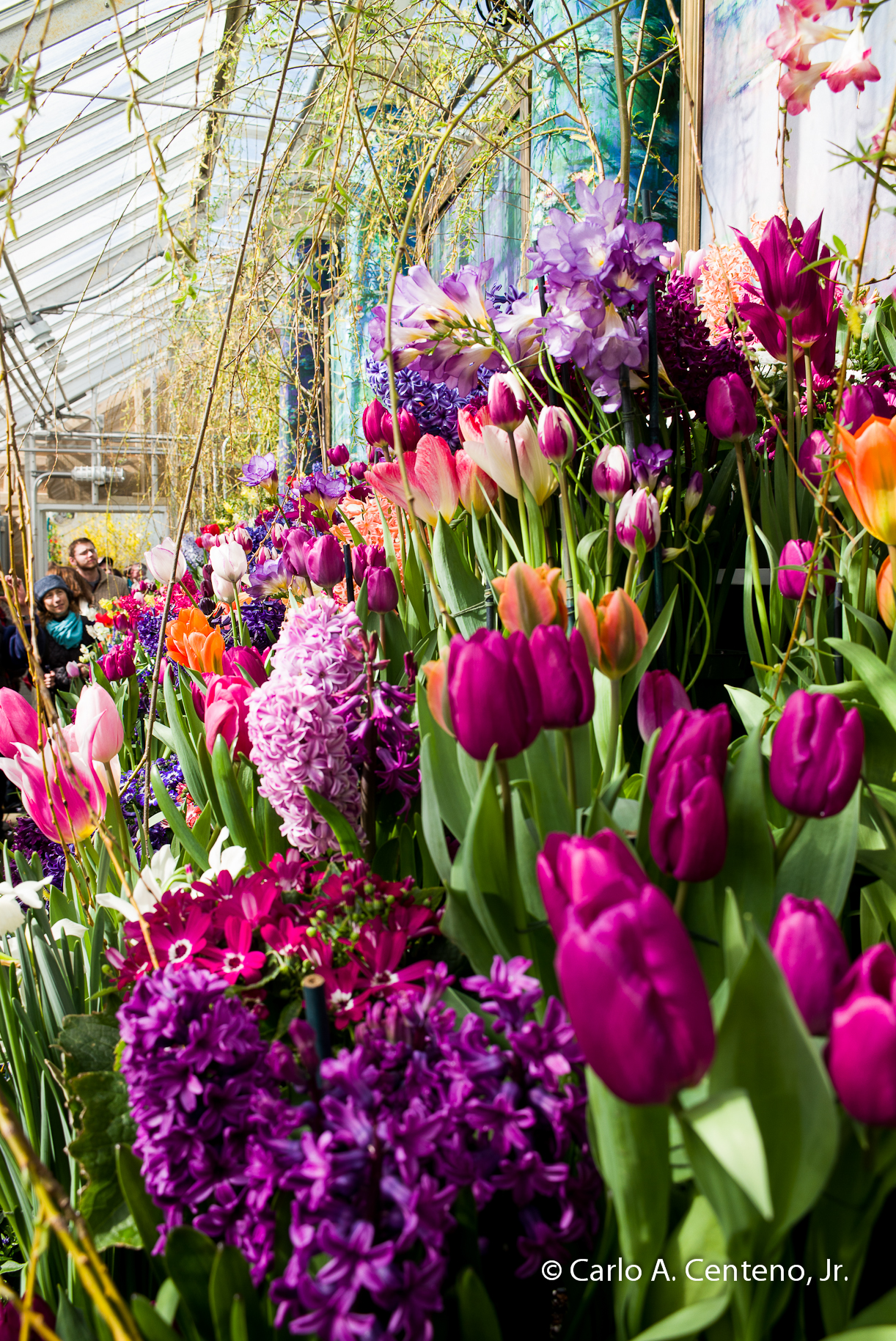
This year’s theme, “Monet’s Garden,” contains relevance. The artist had a fondness for working the earth as well as the paint brush. Monet had indicated that aside from painting and gardening, “he wasn’t good at anything.”

It seems that both gardening and painting were a very good fit for him.


I had a reunion recently. In the real sense of the word, I did see my high-school classmates and enjoyed listening to the way their lives took shape after graduation. Aside from [some] grey hairs, balding heads, [slightly] heavier waistlines, kids in and out of college, the many memories that circled back to greet us were good ones.
In another way, I had my own personal reunion with one of my binders of negatives. I found images from my days at L-C in Connecticut and decided to revisit them, though this time in a digital sort of way: scanning and rendering in post production. One thing’s certain, it’s much easier to scan and develop versus pour, measure, pour again, agitate, rinse, pour, fix, rinse, etc. etc.
The farm fields a la the soccer/lacrosse fields were still there. That pond is gone. I could’ve done a “before ‘n after” photo line-up, but decided, no, the before image has more meaning and substance. The “after” image—like others of its kind—looks too clean, even sterile.
What’s missing in this photography reunion is the ambiance, the nuance, the visceral energy of darkroom work. Your senses are so much closer to the image during development. You feel the smoothness of the paper when wet, made even more so with the addition of a wetting agent to promote spotless drying. The piercing smell of rapid-fixer reminded me to make sure the exhaust fan was on. The glow of the soft, red, safety light confirmed my presence in this other world, a place that made me feel safe, included and perhaps artistically complete.
This is a matter of opinion, but those negatives some 30-plus years old have held up rather well. Aside from dust marks, some scratches here and there, the emulsion has endured, and continues to do so. This is one of the things that I miss/love about analog photography. I can open a box, a binder, some glassine sleeves loaded with film and hold anyone up to a light source and immediately understand that there’s an image in front of me. I may not wholly comprehend what I’m looking at in a cognitive sense, but emotionally, there’s just something magical about looking at something that doesn’t need anything more than light, careful handling and a curious eye.
 Some experts would have you believe that the absolute best way to view art, specifically flat works of art, is from a specific distance and at a specific angle. But there’s more to it than that. The shape, the color[s], the physical size, the subject at hand are a few among other qualities that shape our personal perception of whatever it is we’re looking at. While a 20-foot tall tapestry can express its grandeur at a distance, I’m more intrigued if not fascinated by the handiwork in its creation. I tend to move rather close to such objects in wonderment of the details and the craftsmanship involved.
 The exhibits at a museum, whether curated for a specific event or presention, or shown as part of a permanent collection, are nothing more than merchandise on display. I don’t want that comment to come off as something crass. I’m merely distilling this type of marketing in a simple form, commercial though it seems. Though this may be an oversimplification, compare the engagement to that of a department store. Consider a well-done display of business clothing or outdoor, adventure products. The items on display either spark your interest or do nothing at all. Much depends on what piques your attention and curiousity.
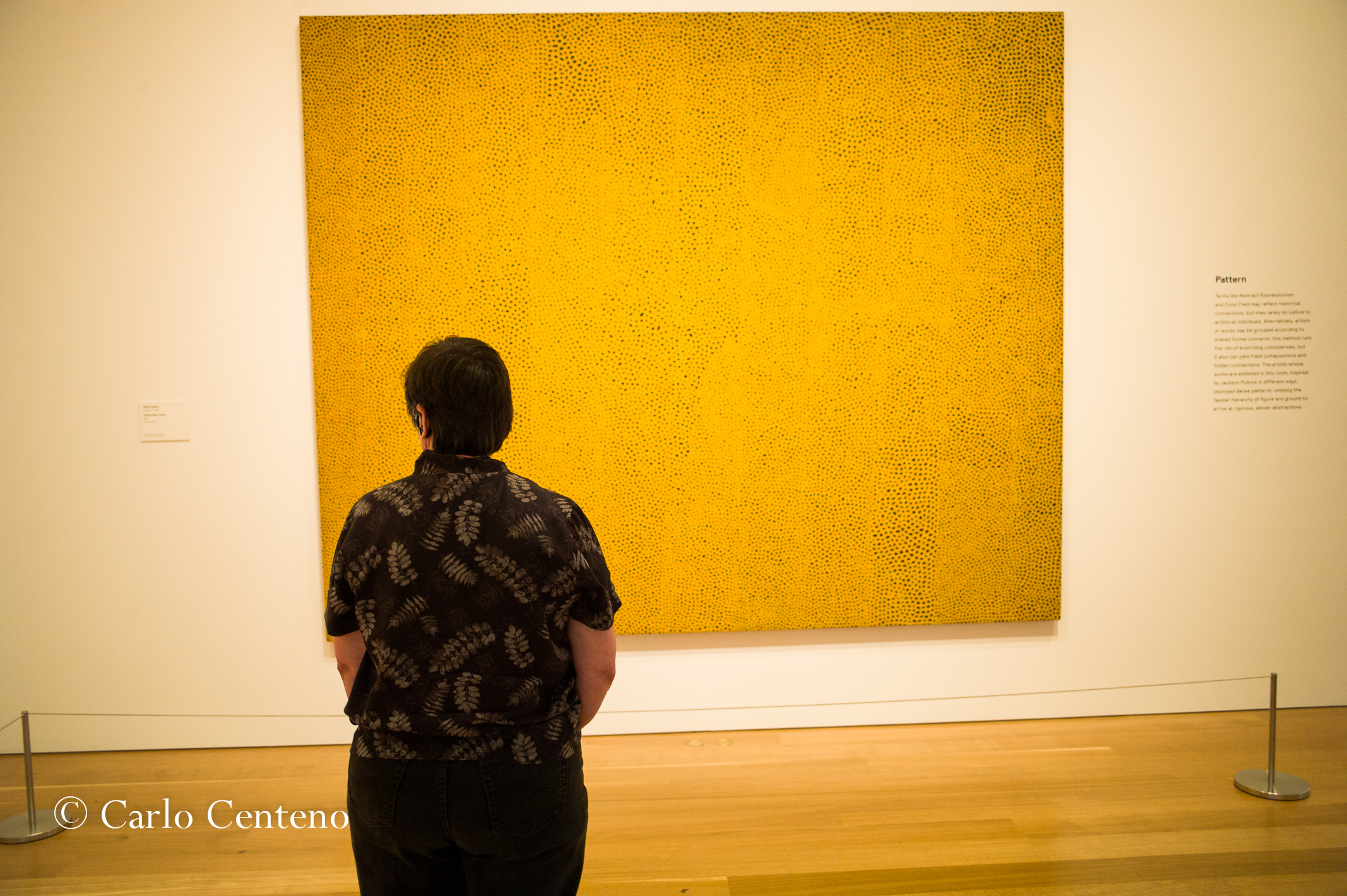 But unlike the department store, we don’t produce our charge cards to aquire a canvas we sense could do something to a room that needs freshening up. Instead what we should do is open our sense of feeling and seeing. What stirs inside us? Does it feel visceral? Is it calming? Does it provoke agitation, confusion or consternation? Does it do anything at all?
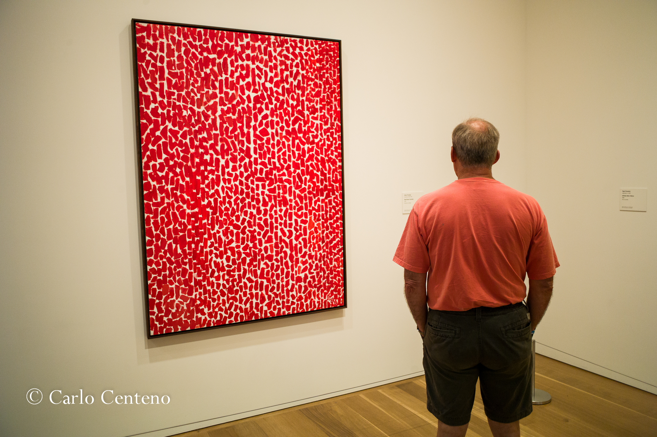
What I can’t describe to anyone reading or viewing this post is the exact physical, literal details about the art: the weight of the paint, the roughness of a brush stroke, the depth of detail that borders 3-dimensional perception. As much as we’d like to say that we know a bit about everything and a lot more about something specific, that knowledge or memory cannot replace being physically in front of the art work.
When I see something on an Apple Retina display, I’m duly impressed with the detail and richness of color. And as nice as that is, the experience cannot replace being right there next to the object or being in front of a vista or being enveloped by the ambiance and a sense of place.
Perhaps this post should be retitled, What do you feel when you look at Art?
Categorically speaking, the selfie is one of the top elements populating sites today. Somewhere in our digital world, popular media has put the spotlight on this ubiqituous “self portrait.” As much as I like coming across a selfie here and there, my preferences for this form of actualization is more personal if not deliberately planned. Not to say that a selfie cannot be personal for the sender or subject. Certainly to each his/her own; I’m in the minority as I don’t send or post selfies unless they’re for family. I suppose people who make selfies and photo bombs part of their daily life think nothing more of them. Thus, I can appreciate the spontaneity and the fun aspect of creating and sending them.
If selfies are genuine windows to our inner selves, then I’d think common sense should prevail. A selfie taken with pals in front of a questionable location will not play well. One example is the selfie of a twenty- or thirty-something doing same, with a brown bear in the background. If I recall, the location was in Alaska at a place popular with tourists and brown bears. The bear was just 30 or 50 yards [27 to 45 meters] away. That’s too close for an apex predator that can reach speeds of up to 35 mph [56 kph] in 100 yards [90 meters]. Safety considerations aside, think in terms of centers of influence [COF] who happen to catch a glimpse of the image.That being the case, the question then becomes:
What does a selfie say about you?
All that you consistently do and say is part of your brand. Variations to such, well, that’s another posting altogether, expecially variations that put you on an orbit other than the one you and others know you’re on.
If selfies are self-portraits and thus a physical extension of one’s personna, then I can surmise that one individual is the champion of such image making: Rembrandt van Rijn [1606-1669]
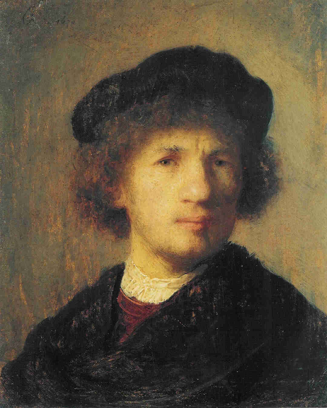
Not only was Rembrandt a Dutch master, he was a creative genius. His “selfies” had much to say about the genius he possessed. He imbued the intangible [his sense of purpose, his focus, his sophistication, e.g.] alongside the tangible [his style of attire, its texture and color; his facial expression, his eyes and hands, e.g.]
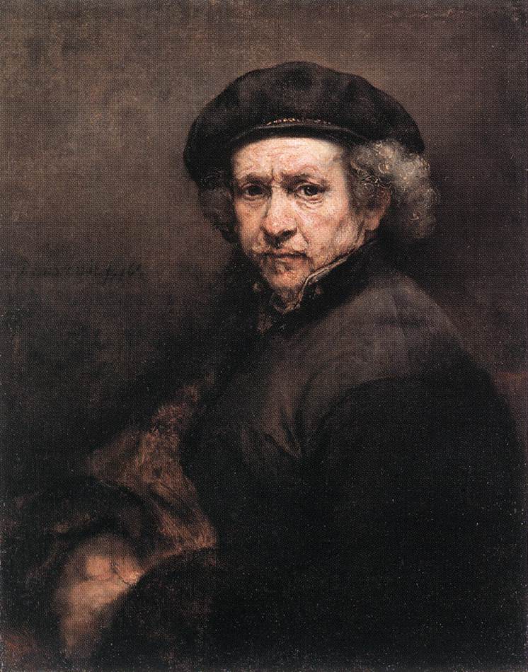
Yes, I’m certain there are other artists who can stand alongside Rembrandt, but he owns the niche.

With age, his selfies contain more detail and texture. There is a quiet confidence—almost regal in tone—that radiates off the canvas. In all of these portraits shown here, the subject is both an aristocrat and an artist, the benefactor and the painter, the model and the creator.

There are other artists who have done self-portraits, that we know, but none have the power of Rembrandt’s canvases. Noted photographer Richard Avedon mentioned that he loved doing portraits because the face is a landscape that tells a story. Just as Rembrandt’s portraits offer something about his brand, so can yours, in this case, the selfie.
But be warned about where you send/post your selfies. You might forget what went where; while others will remember exactly where to retrieve them.
As far as I can remember, B&W images have held my imagination firmly, yet inspirationally. Perhaps it’s how my brain’s wired, or the fact that my wired brain is getting older and thus prone to moments of unusual clarity. Maybe it’s about oxygen loss, electrolyte loss or that i’m just losing my mind.
 Of late I’m remembering things in B&W, photographically speaking. Faces, places, things and so forth. If I close my eyes and remember an important event, more often than not I believe I can see the memory more clearly if it is, indeed, framed in B&W. I have no scientific explanation or simple rationale as to why, but such is the case. It doesn’t always happen, but when it does, I take notice.
Don’t start thinking that this brief treatise is about black and white being “more real” than color. That’s a tired argument made more exhausting when I’m among other photogs who present their case without first having the benefit of a glass of wine or beer…or both.
Grey in all its incomparable shades, levels of intensity and density and luminance, is a wonderously beautiful color. To me, none of it is boring or trite or conveniently familiar. I embrace the liberty that black and white gives me; everything in front of me is unified. The brigthness or darkness provides the lightness and weight respectively of whatever subject is before you.
The photography of Elliott Erwitt—in particular his series on dogs—is unabashedly “light” in nature. Eisenstadt’s iconic image of sailor-kssing-nurse-in-Times Square becomes a beautiful expression of unbridled joy. Ralph Gibson’s images from his collection, Somnabulist, is a journey alongside light’s texture. Yes, there’s texture from the subjects in his images, but you can feel the intensity of his grey scale, an intensity that pushes one’s comfortable notion of contrast, modeling and depth to another level. Cliche sounding? Yes, but you can prove it to yourself by allowing yourself a different POV. For me, no discussion is complete without mentioning the grandfather of Grey as something beautiful: Ansel Adams. Whether it’s a postcard-sized image or a 30×40-inch print, there’s no denying an evocative appreciation of his creativity and understanding of how he feels for what’s in front of him!

Most of all, I sense that grey gives me an empirical appreciation of my life to date. Here’s what I mean: B&W and all its shades of grey acts as an emotional filter, allowing my most genuine feelings to surface. I can safely feel—whatever such feelings might be—at a “safe distance” yet feel a sense of inclusion, maybe even a connection, with the subject at hand. Remember that “subject’ doesn’t necessarily mean what’s tangible in front of you, but a quality that rises from your persona or sense of self.
I’m taken by grey. It’s so beautiful to me…
Noted marine biologist, Edith Widder, Ph.D. has spent much of her life under water. She has in fact devoted her professional energy to creatures living in oceans so deep that the light of day will never reach them. On November 23, Dr. Widder will be giving a talk, open to the public, about her work on bioluminescence and marine life. I’m looking forward to it for a variety of reasons not the least being my curiosity and fascination for things different.
copyright Edith Widder
This photo is a good example of what she studies, specifically, bioluminescence. It’s that unique ability to generate light, light as the result of chemical reactions inside the organism. On the one hand, you have the image on the right side of the frame. It shows the jellyfish as it appears under natural light. The image on the left is the same animal but in suroundings totally devoid of light.
The point I’m getting to is this: is your personal brand consistent across work environments? Does it change in any way, and if so, is the change pronounced enough to be noticed? Think of mannerisms [behavior and comments] and appearance [attire and grooming].
I suspect that under extreme conditions, some people undergo changes that could leave others scratching their head. “When did he decide to wear really nice-looking suits?” However, for most of us, we don’t so much change our personal brand as much as we do tweaking it. We dial in some adjustments to reinforce an attribute or suggest another. A long time ago, I read somewhere—and it probably came from an Italian designer—that three things signal a person’s sense of accomplishment, confidence and purpose: a wristwatch, shoes and writing instrument. Interesting.
Regarding wristwatches, using mechanical watches—either hand wound or self-winding, reinforces to an erudite observer that the wearer has a sense about time’s importance. Mechanical watches require attention. A nice [Swiss, German, e.g.] automatic watch represents a high level of skill and expertise in watchmaking. Costs aside, I like to think that the wearer of such accessories has an awareness and appreciation for fine watchmaking. The same can be said of the other 2 items. A good pen—especially a fountain pen—speaks volumes about the user. And like the automatic wristwatch, observations cover both positive [learned, confident, assured, accomplished, e.g.] and negative [flashy, poor use of money, attention seeker, pretentious, e.g.]. I don’t think I need to elaborate on footwear at this point.
So then, what aspects of your personal brand are you fine tuning? Are the adjustments or changes subtle or dramatic in their expression….like our jellyfish?

