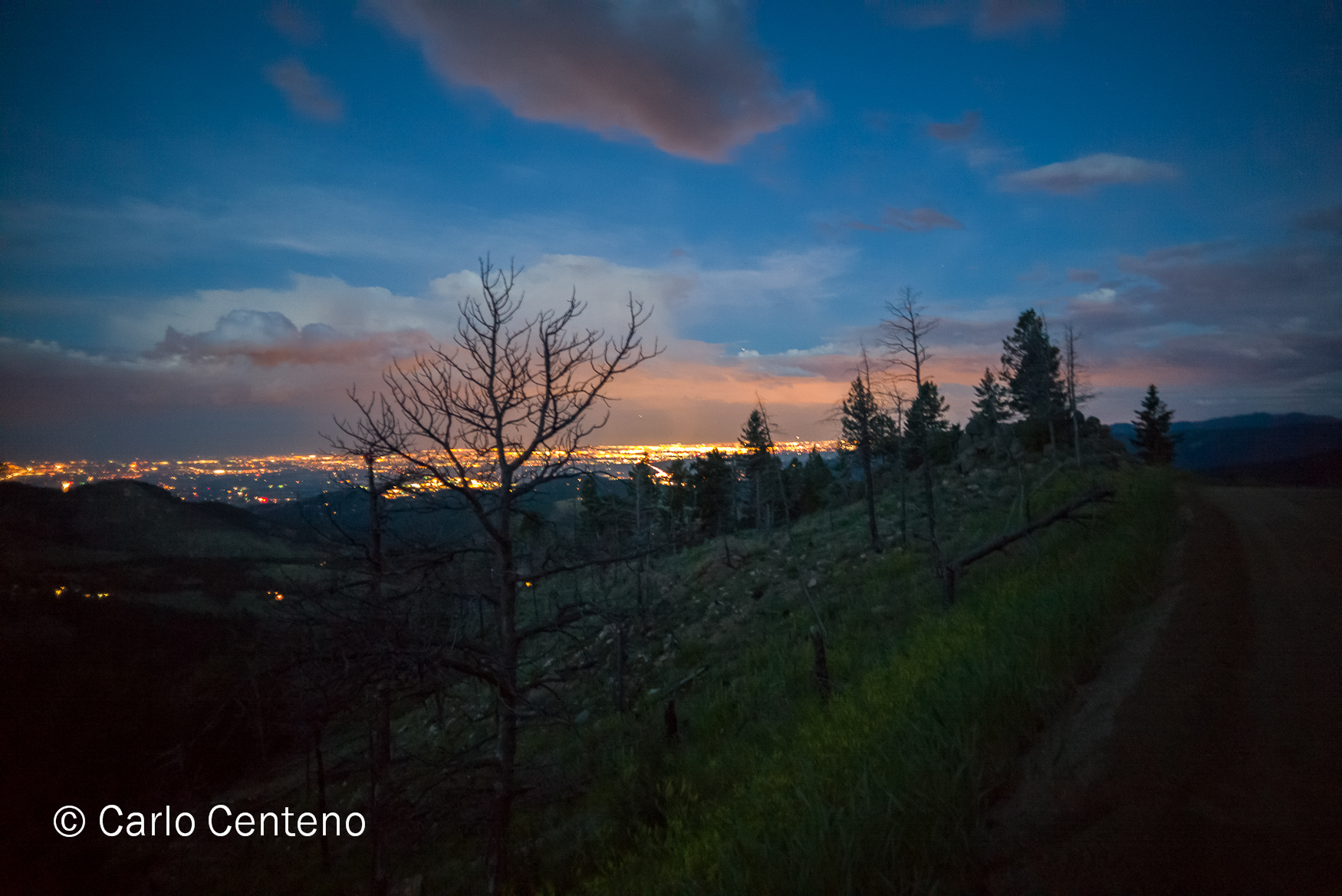
Nostalgia has a way of displacing your sense of place—physically, emotionally, even spiritually. We recently returned from Colorado visiting our daughter and her boyfriend. It was our first time in Colorado. I now have a better understanding of why those 2 love it out there. You encounter beautiful scenery, a lot of open spaces, a more relaxed pace of living and so forth. For the most part, 95% of why we wanted to go was to see our kid [no longer a “kid” I might add]. If she was flung further, we’d still find the means to visit her.
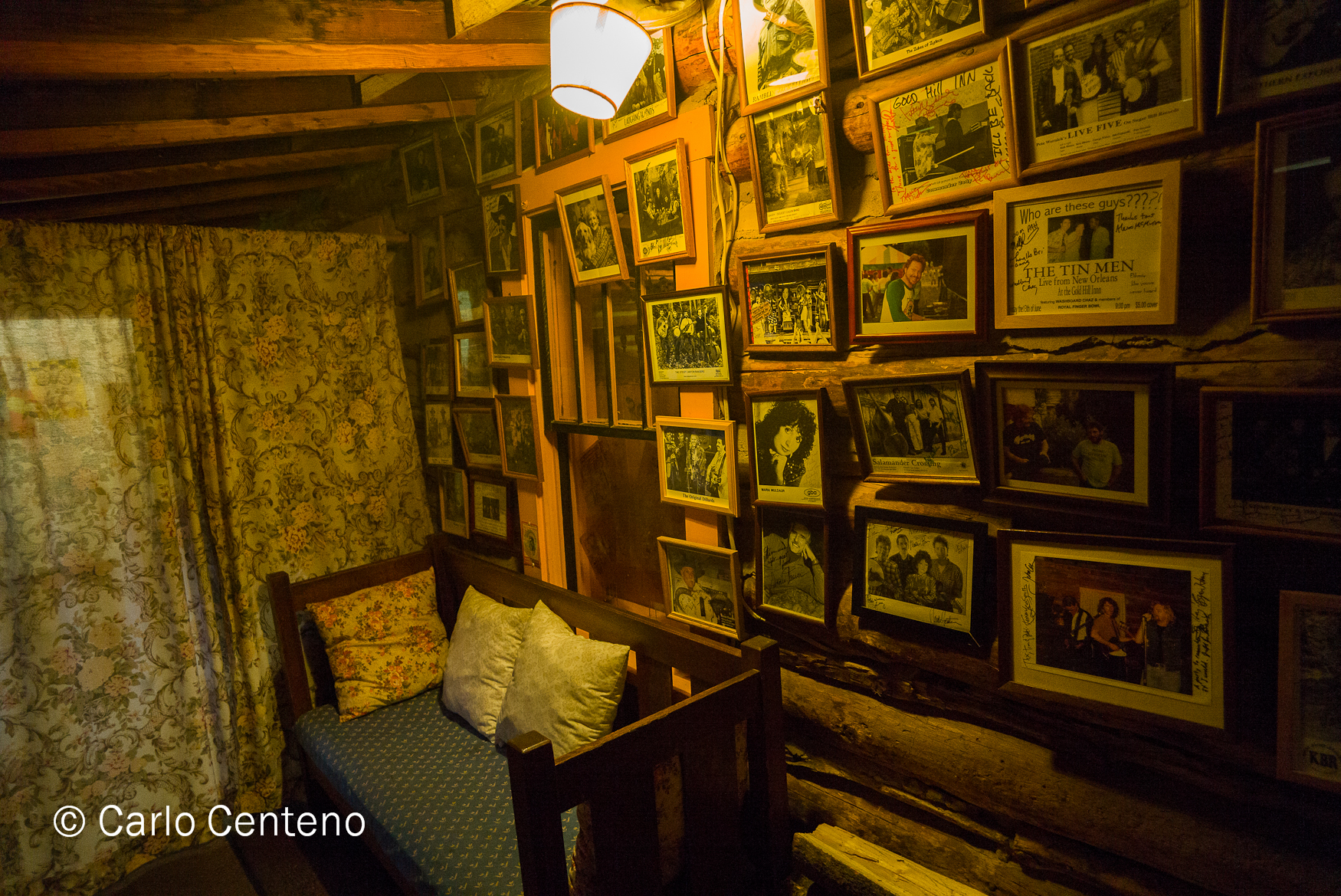
The Gold Hill Inn had a strong pull for me. Specifically the place harkened to a time when you knew most of the townsfolk by name, offered a greeting [mornin’ ma’am] and rarely took for granted what was in front of you. Here was an old mining town and an inn that held no pretense. What you see is what you get, as they say. Conversation you might have overheard was direct and nothing of the dialect we hear or read about in media, whether broadcast, print or electronic.
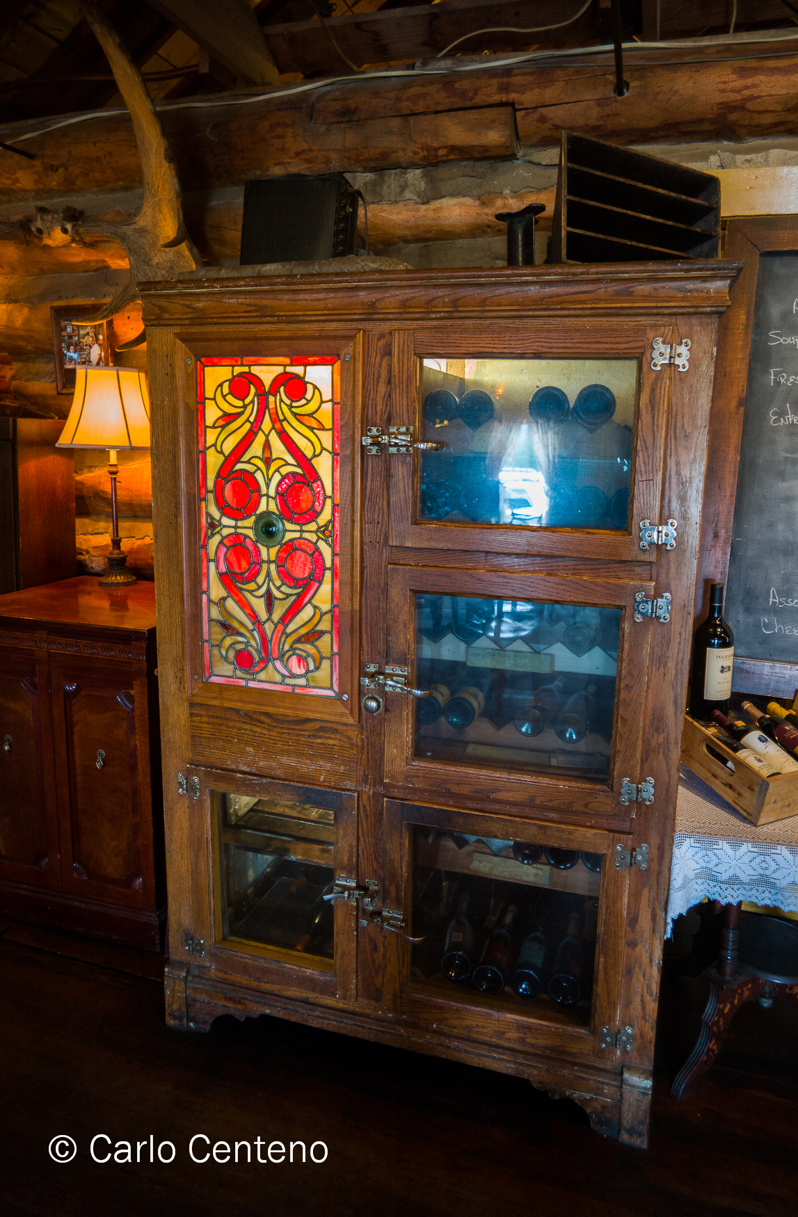 Aside from the obvious modern conveniences of electricity, telephone, running hot and cold water and bathrooms, you can see, smell and hear the straightforward attributes of the time. The wine cabinet looked sturdily built and beautiful to look at. The National Cash Register, while obsolete, still proudly showed off its utility and independence; it required no electrical power but the firm hand of the bartender. No LCDs or CRTs here, thank you. And you better have strong hands and fingers to manipulate the keys and drawer of this handsome machine. And directly above that cash register, what better contrast than the nude portrait positioned just so, as if recumbent on the edge of that register. The fecund suggestions in both portrait and cash register shouldn’t be lost on anyone. Strength, abundance, beauty, even mindfulness, all expressed in just those 2 objects.
The floorboards were just that: a floor made out of wood, perhaps oak or another type of hardwood. When you walked on it, you felt its idiosyncracies. Not all the planks lay perfectly flat, some joints stood higher or lower than the one adjacent. If you happen to wear boots—especially cowboy boots—the firm, “thud” of a heel made known to all that you weren’t innocuous or at least couldn’t be. Try as you might, you can’t ignore that heavy sound on the floor; your natural reaction was to look over to see who was there. Old, young, man or woman, the “thud” sounded and felt the same.  In its simplest form, the declarative sentiment nostalgia often gives to us is, “How much more do you need?” Today, “want” versus “need” often precedes more. All the fundamentals of life are laid bare in this town. Aesthete is in the eye [and pocketbook] of the beholder, but standing in that town, in that room, on main street with an open mind and unhurried cadence only enhanced the value of what was genuine. What you see is what you get, indeed, but sometimes I need perspective on what I already have.